Visualizing the Stress of US Banks
Visualizing the Stress of US Banks
A recurring cycle of regulatory stress testing exercises has become the new normal in the banking world, at least on the two shores of the northern Atlantic. The periodicity of the European stress testing heartbeat has not yet been firmly established. Did we just miss a beat in 2015 (a so called palpitation) or will the European cycle have two (or more) years periodicity? Who knows. Fortunately, there are no such uncertainties around the US stress testing cycle. The US CCAR rhythm seems to be a very robust annual throb and in March we just got the latest iteration.
Stress testing exercises produce a significant amount of new data, some of which are actually made public. As would be expected for such important collective assessments of the health of the financial system, there is no shortage of review and analysis of the outcomes. At Open Risk, in line with our mission, we focus on making the released results more widely accessible, in a visual and hopefully engaging interactive manner.
For this purpose we have released previously the ECB Stress Test explorer and have now expanded this type of web app to cover the US CCAR results.
In this post we discuss visualizing the Stress of US Banks, how these visualizations are setup and highlight some interesting results - but the invitation is for you to play with the interactivity and see what conclusions you can draw yourself! (Make sure to read the disclaimers before investing in any bank contingent convertible bonds though)
Getting started
There are many data variables to work with, so some judicious choices are required or we might lose the signal amidst the noise. To make sense of all the data we settle first on presenting the data as a scatterplot. This type of plot allows us to see immediately the distribution of any one variable against another and establish whether there is a simple relationship, the degree of correlation etc.
We can add useful further information into the plot by choosing size and colour for the data points. We chose to single out two indicators: the firm size and the impact of the severe stress scenario on capital.
Firm size is obviously important to put things in perspective, but which measure of size to use? There are different measures, e.g., balances, or RWA (risk weighted assets). It is reasonable to expect that the different size measures are correlated, so we don’t fret too much about this and we pick the much maligned but still indispensable RWA measure (if you don’t know what RWA is you missing out on a lot of fun, but just take it to mean how big the bank is adjusting for how risky its various activities). The size (surface area) of the individual firms will thus represent their risk-adjusted portfolio size.
A second visual indicator we have at our disposal is the colour of the data point. Given this is a stress testing exercise, we chose to associate the colour with the impact of stress on capital. Hence larger capital impact under stress will lead to more red all around. Keep in mind it is the delta that determines colour, not final capital. (In this exploration we will pretend we don’t know or care about the minimum required capital)
We could add more information, e.g. in the shape of each data point, but this would increasingly make it more difficult to grasp the message of the plot. The names of the banks are not that important for this exercise so we hide them by default. But you can hover over the data points and get the bank name if you are curious.
A tale of three bank species
So lets take a look at the first plot, actual RWA versus actual Tier 1 capital. (Remember this is just a blog post, to see the live plot you need to go to the webapp!)
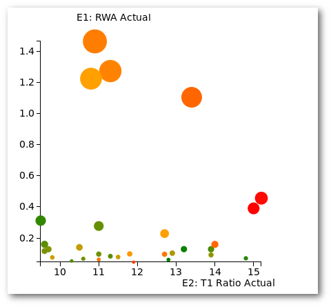
We see immediately an interesting pattern. The population of 31 bank holding companies (BHC) is actually composed of three subtypes:
- Four very large banks (let us call them megabanks)
- Two investment banks in close orbit and
- The undifferentiated rest.
In terms of starting capital (T1 Ratio), the small fry is widely distributed, the megabanks occupy the middle ground and the investment banks are capital champions. But how does the capital situation develop under stress?
Who is more sensitive to stress?
For the second plot we look at the starting tier 1 capital ratio versus the minimum obtained under the severely adverse scenario. So this is an exploration of how sensitive the different BHC are to stress
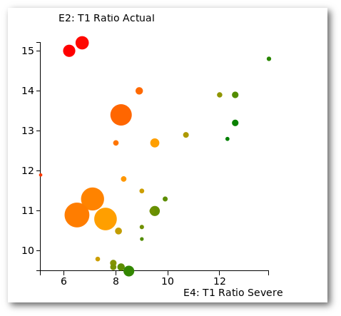
If a bank was totally insensitive to stress it would stay on the diagonal given its capital before and after stress would be the same. We notice a rather peculiar pattern, the bigger the size, the more the fractional capital reduction.
Unless you are an investment bank, in which case the capital reduction under stress is even worse. This is in stark contrast with the European stress testing results where in general the larger the size of the bank the less the sensitivity of capital to stress
Can you uncover further interesting relations? There are 36 x 35 / 2 = 630 different possible combinations to explore! Simply select an interesting pair and click the button 🙂
Enjoy and do let us know what you find!