19, Connecting the Dots, Accounting Graphs for Double and Quadruple-Entry Bookkeeping
Open Risk White Paper 19: Connecting the Dots: Accounting Graphs for Double and Quadruple-Entry Bookkeeping
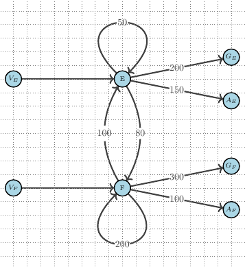
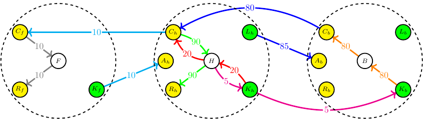
We develop the concept of an accounting graph as an intuitive and flexible tool that can faithfully represent widely used accounting concepts. More specifically, a weighted directed multigraph representation is applied to model standard double-entry bookkeeping (DEB) of individual accounting entities but extended to also provide a consistent accounting graph for larger economic networks that feature multiple transacting entities (so-called quadruple-entry accounting). We illustrate the concepts with stylized accounting examples. Such accounting graphs are promising both as educational tools and towards the application of computational tools on accounting data.