Exploring Community Mobility Reports Using OpenCPM
The community mobility reports and OpenCPM
As the COVID-19 pandemic unfolded technology providers (most notably Google and Apple) made available to the public aggregated and anonymized data about human mobility in the crisis period (on the basis of smartphone location data). These Community Mobility Reports provide insights into how mobility patterns changed in response both to pandemic news and policies aimed at combating COVID-19.
The reports chart movement trends over time by geography, across different categories of locations and activities, such as retail and recreation, groceries and pharmacies, parks, transit stations, workplaces, and residential.
While these reports are unlikely to persist as open data sources, their current availability (as of May 2020) enables providing within OpenCPM a mobility risk dashboard that can help draw insights through visualization and statistical analysis.
The Mobility Data module in the 0.5 Release
The Mobility Data module of OpenCPM is an interactive, visual web application (dashboard) that builds on these open data repositories. The module serves several purposes: makes the raw data easily available online; allows exploration of their statistical properties; enables analyses of relations with other data sets.
In practice the Mobility Data module retrieves statistical data from outside sources, integrates them in a uniform interface and provides data views, visualizations and modelling functionality.
Currently the included data sets are based on the Google reports and all the below analyses refer to those.
The Google Data set
The first release of Google Mobility Data dates from April 3, 2020. The numbers and plots in this blog post are based on Reports updated on 2020-05-04 22:08 GMT.
The current download contains 300,823 datapoints (each datapoint is an observation within a timeseries of aggregate daily observations per specific region and identified “designation” or activity within that region). The data are grouped per country (currently 132 countries) and have a hierarchical structure:
- country level (for some countries this is the only available level)
- regional level (e.g. state or other formal region within a country)
- county level (US only)
There are currently 25,008 distinct timeseries in total.
Missing Data
For a variety of reasons many datasets have missing data. In the current snapshot we opt to leave out dataseries that have missing data. This leaves 12,335 timeseries with a fully populated profile.
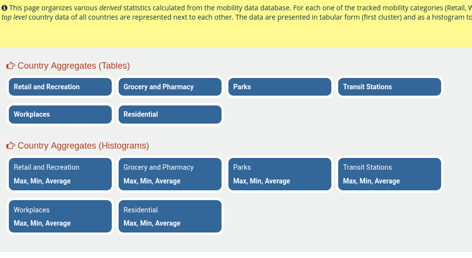
Exploring the Mobility Data app
You can head directly to the landing page of the mobility data app. This looks as follows:
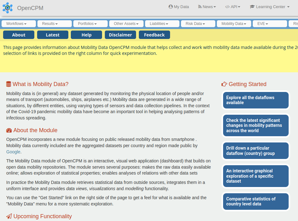
From the landing page you can explore the functionality by following the “getting started links” on the right (or from top bar menu).
An overview of all data
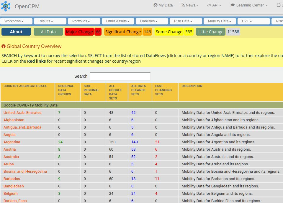
If we follow the “Explore all the available dataflows” link (or “Catalog”) menu item we get to the listing of all top-level datasets (as indicated above, this follows a country scheme). This looks as follows:
Ok, lots of things are happening here! so lets go over them one by one:
- The first column from the left (with the orange links) lists all the countries for which there are data. Clicking on the orange link takes you to a country view.
- The second column (with the green links) lists any regional aggregation within a country (if available). So we see for example that Argentina has 24 regional data groups, Austria 9, while Aruba none. Clicking on a green link takes you to a regional view.
- The third column lists the availability of any sub-regional views. Only the US has at this moment subregional views.
- The fourth column list the total number of datasets per country available in the Google dataset. This would normally be N x 6 or less, where N is the number of regional views (6 are the number of distinct spatial designations tracked per region).
- The fifth column (with the blue links) indicates how many clean sets (with the current data cleaning pipeline) per region. Clicking on these will take you to an overview of cleaned sets
- The sixth column (Fast Changing Sets) is more experimental so we discuss it next in some depth
Detecting Major Changes
Given the large number of data to facilitate filtering cases that exhibit significant short term dynamics we select those that meet some predetermined criteria. Currently this is done as follows: select those timeseries where the average of the last two observations differs from the average of the two prior observations by some thresholds.
This filtering is subject to many “false alarms” because the data exhibit period spikes. More on that below.
The Country Level View
Let’s click on a Country link to see what is inside (We pick Costa Rica for this). We get this view:
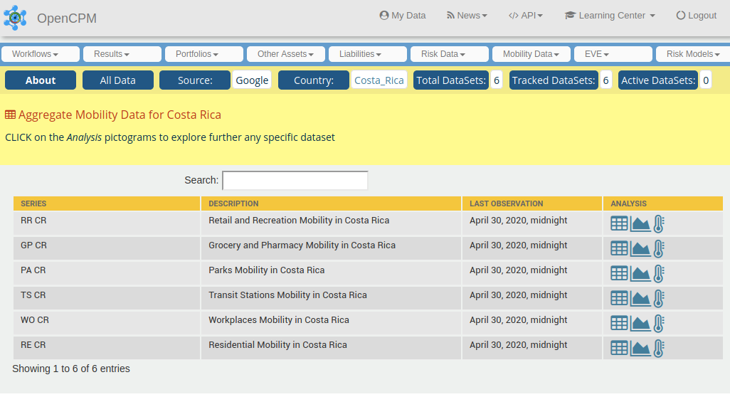
Since Costa Rica does not have further regional granularity we get six entries, one each for the categories of mobility being tracked:
- Retail and Recreation: restaurants, cafes, shopping centers, theme parks, museums, libraries, and movie theaters
- Grocery and Pharmacy: grocery markets, food warehouses, farmers markets, specialty food shops, drug stores, and pharmacies
- Parks: local parks, national parks, public beaches, marinas, dog parks, plazas, and public gardens
- Transit Stations: public transport hubs such as subway, bus, and train stations
- Workplaces: places of work
- Residential: places of residence
What do those mobility designations really mean?
These datasets show how visits and length of stay at different places change compared to a baseline (much more on that below). Hence there is a segmentation of “all” locations into 6 categories and mobility is defined as the presence of people (obviously holding smartphones with location sharing enabled) in the proximity of such categorized spaces.
WARNING: Google states that "Location accuracy and the understanding of categorized places varies from region to region, so we don’t recommend using this data to compare changes between countries, or between regions with different characteristics (e.g. rural versus urban areas)."
Mobility Plot
Let us now dig into the actual data. Let’s select, e.g. Costa Rica’s mobility patterns in Transit Stations (the fourth row on the table) and from the Analyses column lets select the graph icon (the other options is to look at a tabular representation of the data or summary statistics):
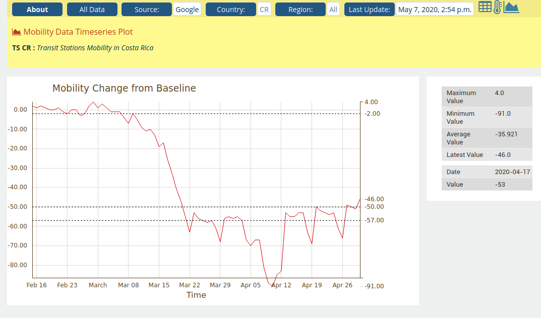
Lets go over the information we have available here.
- First, the x-axis are the well recognized dates since the spread of the pandemic
- The y-axis is percentage (%) decline from baseline
Defining baseline mobility
It is crucial (for keeping the information content of these datasets in perspective) that the plot does not show absolute numbers but relative numbers versus previous observations. More specifically it is the relative change in registered “location presence” versus a baseline measurement sometime in the past.
The baseline measurement is individual per dataseries (hence in this case there is a baseline measurement for Costa Rica Transit Stations) and per day of the week.
Quoting Google documentation: "Changes for each day are compared to a baseline value _for that day of the week_. Hence the baseline is the median value, for the corresponding day of the week, during the 5-week period Jan 3–Feb 6, 2020. The datasets show trends over several months with the most recent data representing approximately 2-3 days ago"
We can imagine that the actual mobility patterns have very strong periodicity (hour of the day, day of the week) which the above mentioned strategy seems aiming to counteract.
Exploring mobility changes
Moving the mouse pointer over the plot (obviously not possible in the static snapshot included here!) the view will isolate mobility values for specific dates. For example we see that up until March 8, values were hovering around the baseline, with the lowest value being circa 90% decline from baseline around April 10.
The table on the right shows some summary statistics (many more are available in the dedicated statistics view per data set).
Some Aggregate Statistics
There are clearly a lot of data points and (subject to the caveats on measurement and interpretation) potentially valuable insights on the impact of the pandemic on mobility patterns. Next we focus on some illustrative statistics, which we reach by the “comparative statistics” item on the mobility data menu:
The Tabular View
This generates a table at country level aggregation, that compares the minimum, maximum and average mobility changes observed. For example, Country Statistics for Retail and Recreation Activity looks like this
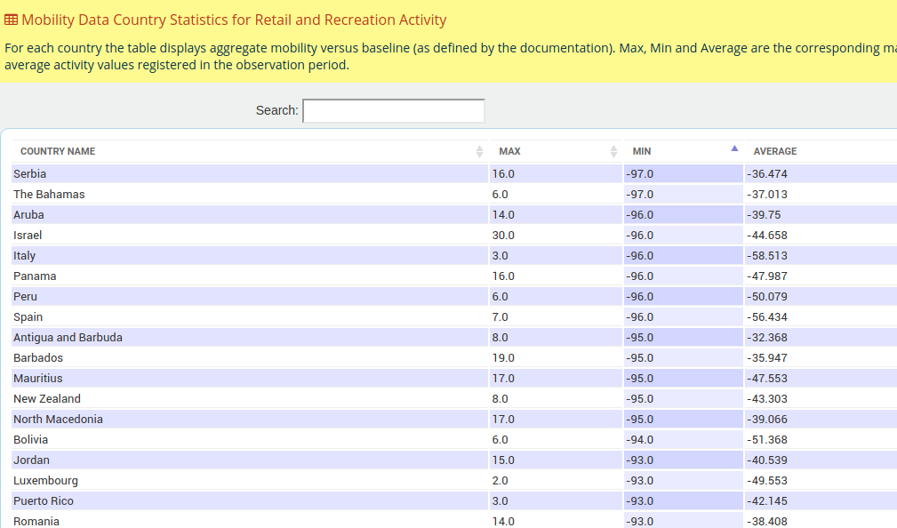
NB: Using the arrows on the table header one can sort by different columns
We notice quite a bit of dispersion, which can be made more obvious in a histogram view (select the corresponding choice from the statistics menu)
The Histogram View
Hence looking again into the same data (minimum observed retail and recreation activity at country level) we get:
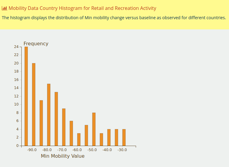
We observe immediately that:
- Mobility declined materially in all countries (at least 30% from baseline)
- There is a group of countries with relatively “mild” decline (up to 60%)
- Most countries show fairly severe decline with the most frequent observation being the maximum decline
Further Insights and Work
The Mobility Data module at OpenCPM is free and open to explore. Feel free to explore and if you have any suggestions / ideas for further functionality get in touch!
Comment
If you want to comment on this post you can do so on Reddit or alternatively at the Open Risk Commons. Please note that you will need a Reddit or Open Risk Commons account respectively to be able to comment!