Comparing Google Community Mobility Reports Across Countries
The community mobility reports and OpenCPM
In a previous post we introduced new OpenCPM functionality that integrates COVID-19 community mobility data (currently from Google). The reports chart movement trends over time by geography, across different categories of places such as retail and recreation, groceries and pharmacies, parks, transit stations, workplaces, and residential.
While these reports are unlikely to persist as open data sources in the long term, the current availability (as of May 2020) enables providing within OpenCPM a mobility data dashboard that can help draw insights through visualization and statistical analysis. In this second post in the series we explore aggregate level data for the reported countries, look in particular at how the most severe mobility restrictions compare with the latest data (as of the publication date of this post - May 19 2020)
Currently, the included data sets are based on the Google reports and all the below analyses refer to those. The first release of Google Mobility Data. The numbers and plots in this blog post are based on Reports last updated by Google on 2020-05-09. (Please refer to the previous blog post for more details about the data set, the data cleaning pipeline and the terminology used).
Comparative Statistics at the Country Level View
There are a lot of data points (over 20K timeseries) and (subject to the caveats on measurement and interpretation) potentially valuable insights on the impact of the pandemic on mobility patterns. In this discussion we will focus on comparative analyses at the country level.
Comparing mobility data across countries is a very approximate exercise as large behavioral and definitional differences may exist. Hence this analysis should be only seen as a high level, directional overview!
Before we embark, a reminder about the main location categories being tracked:
- Retail and Recreation: restaurants, cafes, shopping centers, theme parks, museums, libraries, and movie theaters
- Grocery and Pharmacy: grocery markets, food warehouses, farmers markets, specialty food shops, drug stores, and pharmacies
- Parks: local parks, national parks, public beaches, marinas, dog parks, plazas, and public gardens
- Transit Stations: public transport hubs such as subway, bus, and train stations
- Workplaces: places of work
- Residential: places of residence
There are 132 countries represented in the data, although not all of them have datapoints for all the above categories. Our gateway to exploring the relative mobility situation in different countries is the collection of links in the Statistics page which is arranged as follows:
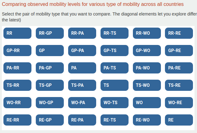
- The table elements are formed from the initials of the different mobility categories. So RR means Retail and Recreation and so on.
- On the diagonal, we have each category on its own. Clicking on the corresponding link takes us to the exploring how different countries compare for this category. For example WO will compare Workplace mobility across different countries
- The metrics we will focus on are:
- The minimum and maximum observed mobilities (which one is more relevant might depend on the context)
- The average mobility over the observation window (Early April)
- The latest mobility level
Scatterplots of Country Mobility Distributions
If we click through on the TS links (Transit Stations) we will get something the following view:
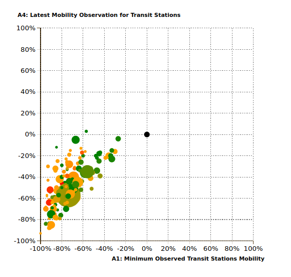
Let’s go over it in some detail:
- We can select different variables to display along the X and Y-axes. In this case we have chosen to have the minimum observed mobility on the X axis and the latest mobility on the Y axis. This means that for each country, we select the lowest mobility reading recorded on transport system nodes (more specifically, as discussed in the previous post, the largest drop versus the baseline value, which is country specific).
- The central black dot represents 0% difference from the baseline (the old normal) mobility observed in each country prior to the pandemic
- Each disk represents the pair of reported mobility values for a particular country.
- The scale of the X and Y-axes reads directly the percentage points decline/increase from the baseline mobility observed before the pandemic
- The disk area scales with total population of the country
- The disk color is an indicator of the intensity of the pandemic as measured by fatality rate (total reported fatalities / population) as per WHO data. The color map is selected to differentiate the levels (red being a higher fatality rate, green a lower one) but obviously there is no intrinsically “good fatality rate” or thresholds thereof. (Some countries do report zero fatalities)
In the live server version you can also hover over the data and see which country is which! Here we will focus on the broad patterns
We notice in this first scatterplot a typical distribution as per the current situation: Most countries are located above the diagonal, illustrating how, in this case transit point mobility, has started to recover from the worst levels.
The economically relevant locations show broadly similar recovery patters
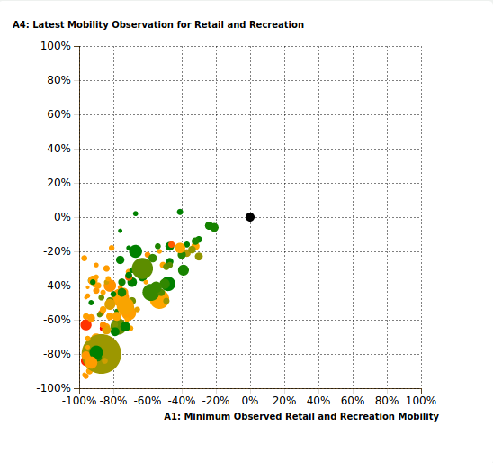
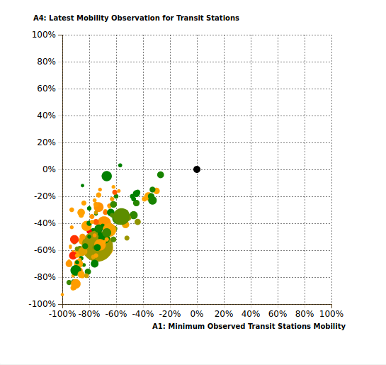
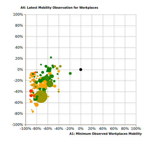
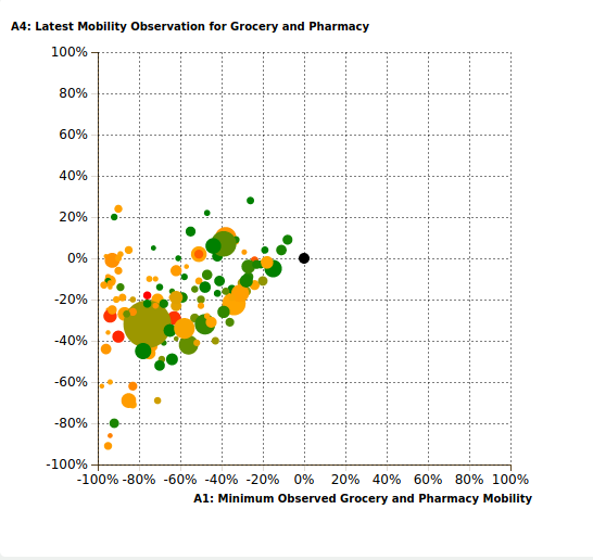
If we display side by side the worst and latest readings of Retail and Recreation, Grocery and Pharmacy, Transit Stations and Workplaces we see the following broad pattern:
In very few countries is retail traffic back to normal
The transit station recovery pattern is fairly similar to retail
NB: The large disk represents India (China is not in the dataset)
In some countries Workplace mobility now marginally exceeds the baseline
NB: The red disks representing thje worst hit countries (Italy, Spain, United Kingdom)
Grocery traffic seems to be the most recovered
But Parks are different
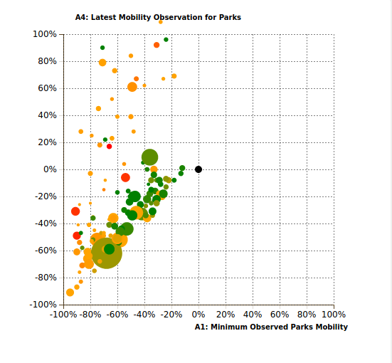
We see some fairly interesting differences:
- There are many countries where park mobility is significantly exceeding the pre-crisis baseline
- There is a fairly clear segregation: more seriously affected countries (orange / red disks) actually show increased mobility around parks and outdoor recreational areas compared to less affected countries (green disks)
Further Insights and Work
The Mobility Data module at OpenCPM is free and open to explore ( registration is required to help keep the demo server functional). Feel free to explore and if you have any suggestions / ideas for further functionality get in touch!
Comment
If you want to comment on this post you can do so on Reddit or alternatively at the Open Risk Commons. Please note that you will need a Reddit or Open Risk Commons account respectively to be able to comment!