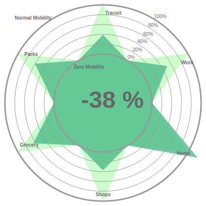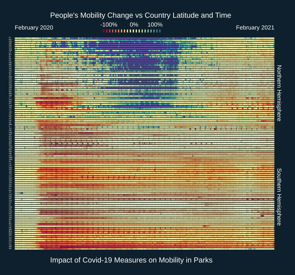
Visualization of a Planet in Lockdown
We visualize global mobility patterns over a full year of pandemic induced lockdowns
Visualizing a year in lockdowns and restricted mobility
As we move into February 2021 the world will be experiencing almost a year under pandemic conditions. This has markedly changed behavioral patterns of human mobility across the board. One major difference with previous pandemics is that through the use of a variety of digital technologies and new data collection channels we know have an unprecedented view of those changing mobility patterns.