Visualization of a Planet in Lockdown
We visualize global mobility patterns over a full year of pandemic induced lockdowns
Visualizing a year in lockdowns and restricted mobility
As we move into February 2021 the world will be experiencing almost a year under pandemic conditions. This has markedly changed behavioral patterns of human mobility across the board. One major difference with previous pandemics is that through the use of a variety of digital technologies and new data collection channels we know have an unprecedented view of those changing mobility patterns.
In previous posts (here, here and here) we introduced the Open Risk Dashboard functionalities that integrate COVID-19 community mobility data (currently focusing on the datasets provided by Google).
As a reminder, these reports chart (over time) human mobility trends collected from mobile geolocation (GPS) data. The granularity of the publicly available data is aggregated by geography at three possible levels (country, state/region, and sub-region) and across different categories of places / activities such as:
- Retail and Recreation: restaurants, cafes, shopping centers, theme parks, museums, libraries, and movie theaters
- Grocery and Pharmacy: grocery markets, food warehouses, farmers markets, specialty food shops, drug stores, and pharmacies
- Parks: local parks, national parks, public beaches, marinas, dog parks, plazas, and public gardens
- Transit Stations: public transport hubs such as subway, bus, and train stations
- Workplaces: places where people predominantly work
- Residential: places functioning primarily as residence
Abstracting Space and Time on a 2D Graph
We will focus in this exploration on country level data. This is the most uniformly populated category (but even here there are marked differences in data completeness / quality as different countries may provide different subsets (see also all the caveats about Data Quality in previous posts and, not least, Google’s own disclaimers.)).
For each available country we havesix* timeseries of mobility data, one per mobility type, spanning a period of almost a year.
- We will order countries by their latitude. Following the usual (but by no means required) convention of showing the North Pole at the top of the map, the country nearest to the North Pole will have the honor of being at the top-most edge of the graph.
- By the same token, the country closest to the South Pole provides the last, bottom-most, dataseries
- The mobility value measured per country and day will be color coded with the color map ranging from deep red when mobility drops 100% versus “normal mobility” and deep blue when it grows 100% versus normal (Note: while -100% is a lower bound, the upper bound on measured mobility is not sharply defined).
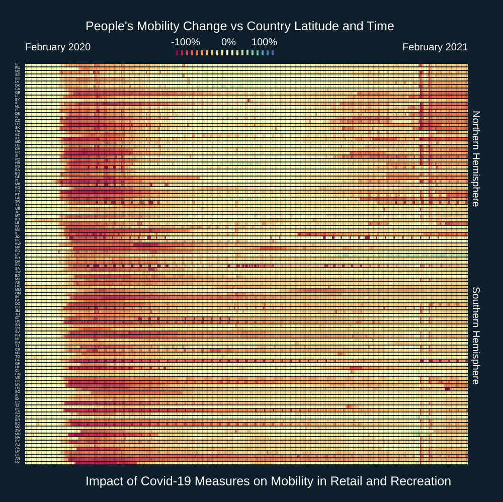
Diving into some particular time series of Retail & Recreation Mobility
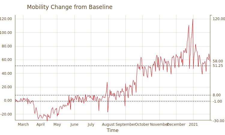
Eyeballing the map we pick one horizontal line featuring a particularly red patch, roughly 2/3s from the bottom of graph. This line represents the mobility data for the country of Spain (ES).
Let us take a closer look at that specific dataset (that will also help us better understand other features on the map.). If we navigate to the Country overview for Spain and then select to view the plot of the Retail and Recreation Data we will see something like the following mobility timeline:
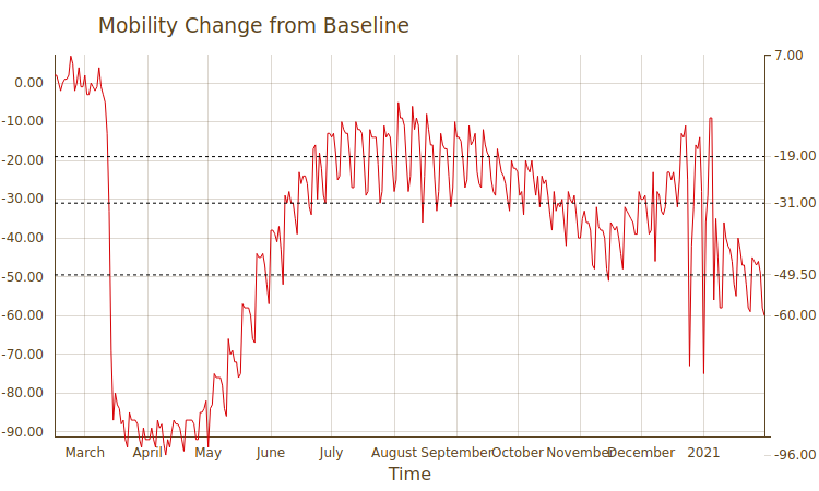
- We can indeed see and confirm the dramatic drop in Retail and Recreation mobility that occurred at the onset of the pandemic in Spain (down to 90% of normal values), which was of-course the result of the complete lockdown during Spring last year.
- In the timeseries plot we see also the repeat patterns of increasing / decreasing mobility as conditions are eased and tightened in response to epidemiological data
- We see in particular the increase in mobility during the Northern Hemisphere holiday season, which was then followed by further decrease (although none as as severe as the first one)
Returning to the global map, the general pattern of a second epoch of reduced mobility in the Northern Hemisphere contrasts with the less pronounced mobility restrictions in the Southern Hemisphere during the second half of the year. This is visible maybe most remarkably in the very lowest (in latitude!) country in the collection, namely New Zealand:
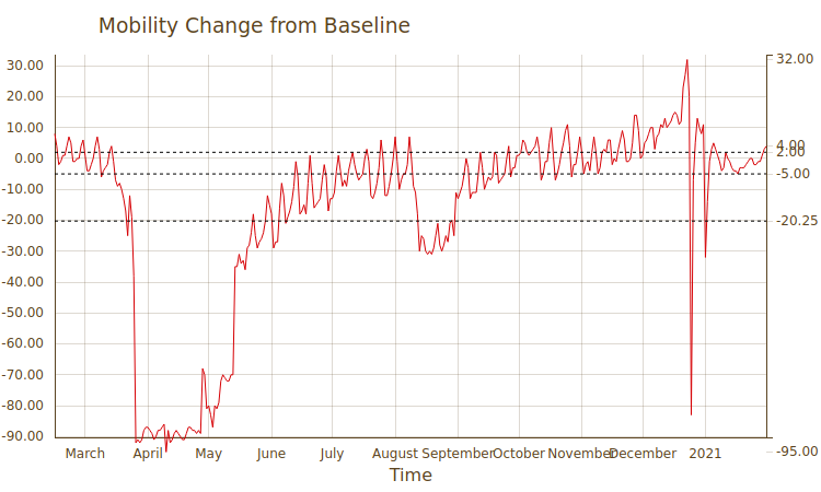
New Zealand has been acclaimed for its handling of the pandemic and on this timeseries we may be seeing some evidence of how this has played out. The initial mobility restriction was as severe as any, but we notice a remarkable recovery afterwards which is only punctuated by limited setbacks.
Diverging Patterns in North and South
The diverging pattern of mobility over time is more pronounced if we turn our focus to mobility around areas designated as Grocery and Pharmacy.
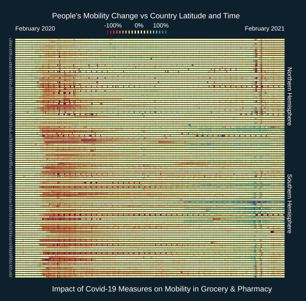
We notice here that, starting already with countries near / above the equator and for many southern hemisphere countries, there are pronounced patterns of increased, that is above average mobility in the second half of 2020. Those are blueish patterns on the right side of the visual.
If we dive into a particularly egregious example( Burkina Faso) we see that in the second half of 2020 mobility around grocery areas was 50%+ above baseline.
Rediscovering Parks and the Great Outdoors
It is by now a fairly well studied fact that people’s behavioral patterns during the pandemic have adapted to compensate for the constraints imposed by the social distancing requirements. For example many people have adopted the forgotten art of… walking as an alternative / substitute for other forms of exercise or collective sports that are not longer possible under various forms of lockdown.
This phenomenon is visible in rather spectacular fashion in the Parks mobility scan:
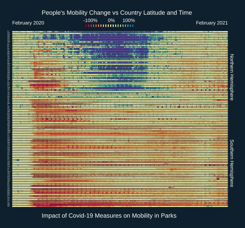
We observe some remarkable patterns:
- In the hardest hit “early” countries in Europe (Italy and Spain), mobility in parks collapsed during their first lockdowns
- In contrast, several countries in Scandinavia had an early and persistent increase in Park mobility that was particularly pronounced during the Summer in the Northern Hemisphere
- After the initial lockdowns were relaxed, most countries in the Norther hemisphere enjoyed increased Park mobility during their Summer
- There is a stark contrast with countries in the Southern hemisphere, where there is little systematic increase in Park mobility to talk about
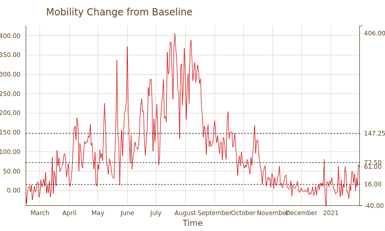
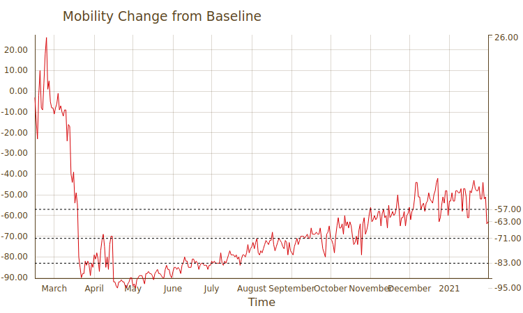
This very divergent response can be highlighted most dramatically by comparing Park mobility in Denmark versus Argentina. In the former, mobility has skyrocketed and hovered above baseline throughout the year, whereas in the latter, it never recovered…
Discovering More
We really only touched the tip of the iceberg of the modified mobility patterns induced by the covid-19 pandemic.
Comment
If you want to comment on this post you can do so on Reddit or alternatively at the Open Risk Commons. Please note that you will need a Reddit or Open Risk Commons account respectively to be able to comment!