21 Ways to Visualize a Timeseries

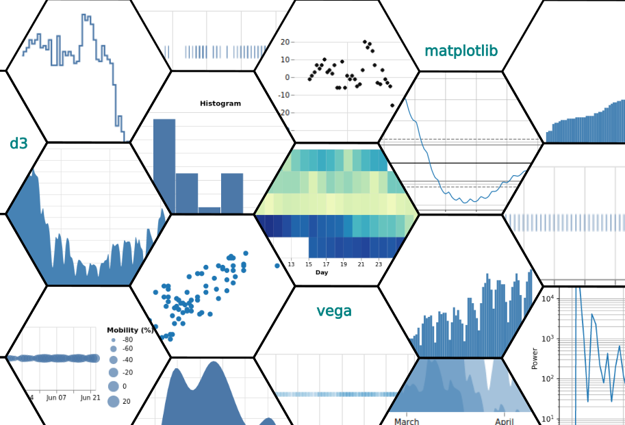
We explore a variety of distinct ways to visualize the same simple dataset

What this blog post is about (and what it isn’t)

With the ever more widespread adoption of Data Science, defined as the intensive use of data in various forms of decision making, there is a renewed interest in Visualization as an effective channel for humans to understand data at various stages of the data lifecycle.

There is a large variety of data visualization tools which can produce an ever more bewildering variety of visualization types

21 Visualizations of a Timeseries

So far, so good, but powerful tools used in the wrong way can have unintended consequences. Visualizations are powerful tools and thus come with their own challenges: The message conveyed to the viewer through a visual may be intentionally or unintentionally skewed or biased. We will try to demonstrate in this post that, in a sense, no amount of caution can avoid these challenges:

Any visualization - without exception - must make opinionated choices about how to transform the underlying data to produce a visually perceivable artefact

Thus, the best we can hope for in this respect is to have increased awareness of the risks and opportunities when using visualization. In turn this is best achieved by developing a deeper understanding of the visualization “production” process.

There are two broad classes of transformations involved in producing a visualization:

  • Mathematical transformations that are applied in “data space”. This class of transforms is optional (but very common). It concerns and involves various mathematical maps, filters and related operations that start with original data and produce intermediate data. These intermediate results still representing the same measurement.
  • The (final) visual map, which is itself also a mathematical transformation, but it is of a very special type, in that it links the data space with visual space and thus with the representation we eventually see.

This post aims to shed some light into this transformation process, by illustrating various distinct visualizations where:

  • we keep the dataset intentionally the same (and rather simple) and
  • we vary the applied transforms.

This post is not an enumeration of visualization types or a cookbook of how to visualize data! It is rather an excursion into the fundamentals of visualization - a partial deconstruction of the process to highlight some common techniques and associated issues.

After the reader completes this journey they will hopefully have a better intuition about how visualizations are put together, and thus be better able to use this fantastic tool in support of their data science objectives.

In order to keep the task (and reading time) finite we will exclude from the discussion the following:

  • the display of categorical or ordinal data (our sample will be a numerical timeseries)
  • working with more complex timeseries where the observations at each time point are not a single scalar but rather “objects” (for example already adding error bars to measurements produces a more structured and complicated timeseries)
  • we will not consider visualizations that involve multiple distinct timeseries (so-called mashups of separately measured phenomena)
  • we will discuss some of the mathematical transformations usually performed in connection with visualization but there are many, many more!
  • we will (largely) ignore pictograms as they bring in a completely different perception paradigm
  • we will stick to the 2D plane (not due to lack of imagination :-)
  • we will ignore animations and/or dynamic visualizations (e.g. graphical elements such as tooltips that appear on hover of a pointer). These tools inject even more complex structures and transformations into the visualization process.

NB: The size of the above “ignore list” shows how vast the space of all possible visualizations!

Some Preliminaries

We will work with a single numerical timeseries. But what is a timeseries?

An elementary numerical timeseries is a collection of ordered, timestamped observations (measurements) where each observed value is a numerical scalar obtained from the same measurement process.

What is a Timestamp?

We will not go deeply into the many, many details that require precise definition before we capture “time” as a data point (accuracy, formats, calendar conventions, timezones to name but a few). For our purposes it suffices to define a timestamp as the representation of a point in time with the required accuracy. This could be, e.g., a day convention according to some calendar (e.g “08-06-2020”), or the number of milliseconds since 1970 expressed as an integer number (No kidding - this is actually the UNIX epoch convention!)

The Mathematical Graph

To discuss the construction of visual graphics we must discuss mathematical graphs (no worries, just at high-level). In mathematics, the graph of a function $f$ is the set of ordered pairs $(x, y),$ where $f(x) = y$. The following is a random mathematical graph from Wikipedia:

Graph

Our core mathematical graph representing a timeseries will be denoted as $(t, v)$, where $t$ is a timestamp and $v$ is a scalar value.

Mathematical Transformations

Timeseries data can be transformed in an infinite number of ways before they are actually visualized. We will see some of those transformations in the sequel. For example, values can be binned to produce a histogram. One can smooth or apply differences to bring out some aspect of the data. One can apply a Fourier transform to create an entirely different, so-called, frequency domain representation.

Each such transformation creates (for visualization purposes) essentially a new mathematical graph, even though from a content perspective it is obviously still representing the same underlying phenomenon. Mathematical transformations can be stacked: the output of the first transform becomes the input of the next one etc. More complex computational graphs are also possible.

The Visual Map

Once the last required mathematical transformation has been applied, a final mapping performs the magic: It maps whatever values we have obtained up to this point to the final visual space (canvas) that we will be working with. For example, one visualization might be obtained by mapping the temporal value $t$ of an observation into a “horizontal” spatial dimension $x$ and anchoring some visual element (e.g. a triangle) to that coordinate.

Those visual maps define the “aesthetics” of a visualization and can be extremely rich in structure, reflecting the many cognitive tools and tricks we have developed to convey information (the landing page of D3, the popular open source visualization library offers testimony for this reality:

D3 Landing Page

As aptly stated by Leland Wilkinson in The Grammar of Graphics,

Aesthetics is what turns graphs (the mathematical structure of the data) into graphics, the visually perceivable object

Aesthetics has various attributes. Some of them are more important for our purposes than others. For example one can use different shapes to represent data points (circles, squares etc.) but the conceptual difference might not be essential.

Visualizations involve also many secondary aesthetic elements that aim to aid comprehension: Additional marks and visuals such as axes, ticks, legends etc. While these elements can be very important or even essential for comprehension of the data content, they fall outside the main thrust of visualization structure that we are discussing here.

The timeseries we will use

The single timeseries dataset we will use in all examples is an actual mobility dataset from Google’s open data community report. We will not dig too deeply into the meaning of this data set. Some of it we will discover step-by-step through different visualizations, but the discussion aims to be somewhat generic and not be distracted by the specific example. For those interested in the mobility dataset, a more in-depth exploration of such datasets is available at the OpenCPM demo

Some stylized facts about this timeseries:

  • As of posting it includes about 130 measurements (timepoints).
  • The reported measurements start mid-February 2020 and are (normally) daily.
  • The values are actually percentage points (e.g. 7.0 means 7.0%) and are versus an (unknown) baseline measurement that follows some complicated algorithm based on prior data.

Viz 1. The first example of a visualization is actually… the data table itself

The tabular representation of the timeseries looks like this (just the first few observations):

Time Value
2020-02-15 -1.0
2020-02-16 1.0
2020-02-17 3.0
2020-02-18 7.0
2020-02-19 5.0
2020-02-20 7.0
2020-02-21 10.0

The title of this section is a bit facetious, but not completely so! Take a closer look:

The tabular visualization of a timeseries uses some very familiar pictograms. The elementary visual building blocks are:

  1. the alphabet and
  2. the representation of numerals.

Two sets of pictograms (dates and values) are displayed next to each other, the spatial association between the two indicates that the measured value depicted on the right side of the table corresponds to the date on left side. We can summarize the structure of this “tabular visualization” in an infobox (which we will repeat in the sequel for all other visualizations as well):

Purpose: Represent the actual data to desired accuracy.
Mathematical Transform: None. The data are shown as-is.
Visual Map: $(t, v) \rightarrow (T(t), T(v))$, where the temporal value $t$ is converted into the textual encoding $T(t)$ for the timestamp (following a date format convention) and displayed along the vertical dimension. Similarly, the measurement value $v$ is converted into a string, following the corresponding floating point representation conventions (notice e.g. the use of a dot).

Most people would agree that the tabular representation is a very faithful visual representation of the timeseries! In fact, tabular representation is the golden standard against which other graphical representations are judged - because it does not suffer from various possible representation pitfalls. As mentioned, the use of pictograms is outside the scope of this post.

The excellent usability of the tabular representation does not mean that it does not have its own issues: For example:

  • large datasets (exceeding a few dozen rows) may be completely incomprehensible to the average human
  • simple stylized facts about the timeseries (any trends, periodicity etc) may be very difficult to spot
  • in the absence of additional data via e.g. proper error estimates, the number of significant digits used in the representation can subtly change the message (the false sense of accuracy effect.)

Indeed, if tabular representation could usefully express all the interesting content of our data we would obviously not much care about the art and science of data visualization! To paraphrase: If a picture is worth a thousand words, a graph is worth a thousand data rows!

The relationship of visualization with exploratory data analysis is covered in an openly accessible Open Risk Academy course as part of the Data Science collection.

An elementary timeseries is already a complex object

Before we embark on our graphical adventure it is useful to further deconstruct the timeseries. Within each typical timeseries lurk two simpler timeseries that we can consider as its two building blocks:

  • A sequence of timestamps $t$.
  • A sequence of values $v$.

The two are associated by assigning to each timestamp one and only one value. In the next group of visualizations we will decouple these two strands (a bit like unfolding the two strands of DNA!) and we will focus on truly one dimensional (“1D”) visualizations.

Viz 2. The 1D Plot of Measurement Times

Observation Times

Purpose: Understand the distribution of observation times
Mathematical Map: Projection $(t, v) \rightarrow (t)$
Visual Map: The visual map that applies here is $(t) \rightarrow (x)$, where x is a spatial dimension (here horizontal) representing time.

The regular pattern of observation times we have in this case does not convey much information, as it very likely reflects a choice in the preparation of the dataset. In many actual situations (e.g when measuring point processes and other irregular random events) a list of event times will convey a lot of important information encoded in the dataset. Incidentally this plot can also help with identifying missing data!.

Viz 3. The 1D Plot of Measurement Values

Observation Values

Purpose: Understand the distribution of observation values
Mathematical Map: Projection $(t, v) \rightarrow (v)$
Visual Map: The visual map that applies here is $(v) \rightarrow (x)$, where x is a spatial dimension representing value

This plot shows us the distribution of values along a single dimension. We ignore all information about the “when” and focus on the “how much”.

  • We see immediately the range of measured mobility changes (from +20% to -100%), although we need the support of labels to actually grasp this quantitatively.
  • We also perceive a gap (relative data paucity) in the range (-10%, -30%)

Notice that even though this is a one dimensional visualization, for visibility the marks of the measurements must have some extent along the second dimension (of height). The choice of this geometry does not carry any other intrinsic meaning beyond making the marks legible.

Viz 4. The 1D Color Plot of Measurement Values

Color Plot

Purpose: Understand the distribution of observation values over time
Mathematical Map: None. We use both data dimensions as-is
Visual Map: Using a map $(t, v) \rightarrow (x, c)$, where $x$ is the spatial dimension representing time and $c$ will be the color for the mark representing the measurement value (we use a filled square and the color space spans the blue)

In this vizualization we take a first look at the complete timeseries. It illustrates that in principle we can use the color dimension to capture value variation (and thus be very economic with the use of visual space).

  • We get immediately a rough overview of when values were relatively high (early on), when they dropped (near the middle) and the slow recovery (near the end)
  • We also get a glimpse at what seems to be a periodically occurring low measurement
  • The use of a legend is absolutely essential for getting a sense of magnitude
  • The depiction of recognizable dates in the axis occupies quite a bit of space, hence we can only place indicative placemarks

Viz 5. A 1.5 Dimensional Bubble Plot of Measurement Values

Bubble Plot

Purpose: Enhance understanding of the distribution of observation values over time
Mathematical Map: None. We use both data dimensions as-is
Visual Map: Using a map $(t, v) \rightarrow (x, r)$, where $x$ is the spatial dimension representing time and $r$ will be a size dimension for the mark representing the measurement value (we use a filled circle)

We notice that with the effective use of the second dimension we can get a better feeling for the distribution of mobility in time. The decline and recovery is more visible, and the same applies to the periodic dip. But we still have some perception problems:

  • There is an overlap of neighboring points (resolving this might require sampling fewer values - and thus losing information)
  • The sense of magnitude coupled to the size of a visual element (here the circle) is quite imprecise. Notoriously, this can also be abused when size is coupled to a linear attribute (such as radious), versus the surface attribute.
  • Using a legend is imperative, as otherwise we have little sense of what of the absolute value of the measurement.

The limitations of color and area in representing a dimension are well studied and are linked to the psychophysical function of various stimuli. See e.g., Shiffman, Sensation and Perception: An Integrated Approach

Viz 6. The Purist Scatter Plot

Scatter Plot

Purpose: Display an accurate distribution of observation values over time
Mathematical Map: None
Visual Map: Using a map $(t, v) \rightarrow (x, y)$, where $x$ is the spatial dimension representing time and $y$ is the spatial dimension representing value. Place a small circle at the corresponding coordinates.

In some sense the scatterplot is the purest 2D representation of a timeseries. We immediately see the superior ability of using length along a second dimension (the vertical y-axis) to better resolve the content of our data timeseries:

  • The ups and downs are captured more vividly (and quantitatively more accurately)
  • We can pinpoint turning points
  • We get a sense for the local structure (small changes from step to step)

The scatterplot does have a key disadvantage, though: The distribution of points on the graph surface may create confusion as to the actual temporal order of observations! This happens because the x and y graph dimensions are intrinsically both spatial but we are using them in an overloaded way to represent two qualitatively different dimensions. (NB: The effect may be worse if the size of the marks is larger leading to visual overlap).

A scatter plot may not be an appropriate visualization type for a time series if it confuses the ordering of observations. Selecting smaller symbols for the representation of points may help.

Viz 6. The Universal Line Plot

Linear Line Plot

Purpose: Display an accurate distribution of observation values over time with a clear sense of continuity and temporal ordering
Mathematical Map: None
Visual Map: Using a map $(t, v) \rightarrow (x, y)$, where $x$ is the spatial dimension representing time and $y$ is the spatial dimension representing value. Interpolate the unique line between two observation points.

Finally the true content of the data seems to be revealed! Besides the precise patterns we have already seen with previous plots, the recurring pattern we noticed before is now very visible.

The line plot is maybe the most widely used graphical display of a timeseries.

  • It capitalizes on length perception being more responsive to stimulus than brightness, volume or area
  • By creating the impression of continuity, it helps clear the fog associated with nearby values in a scatterplot

The linear (or line) plot is so widely used that when we think about a concrete timeseries dataset we instinctively may use it as a proxy for the dataset itself. Yet we should never forget that it is only one of the 21 representations :-).

The use of a connecting line in a line plot is an assumption translated into a visual operation.

The underlying process may or may not be continuous. Even if it is, its degree of smoothness may not be best represented by the piecewise linear assumption.

Viz 7. The Step Plot

Linear Step Plot

Purpose: Display an accurate distribution of observation values over time with minimal assumptions about inter-observation behavior
Mathematical Map: None
Visual Map: Using a map $(t, v) \rightarrow (x, y)$, where $x$ is the spatial dimension representing time and $y$ is the spatial dimension representing value. Interpolate step wise between two observation points (with left, right or centered options available).

The information conveyed by the step plot is largely similar to the line plot. But there is some subtle nuance: instead of the spiky and abrupt changes of the line plot that suggest randomness, the blocky appearance of the step plot suggests an underlying discreteness.

In reality we have absolutely no information about what (if anything) to insert between the known valuation points. Hence 2D line plots always involve some type of interpolation that accentuates the data set in different ways. Many options exist:

  • Linear interpolation (the line plot we have seen already)
  • Step wise interpolation (Assuming values are constant and equal to the previous or next observation). This is the step plot we discuss here
  • Some non-linear interpolation that smooths the appearance of the data (we will see next)

Which interpolation is appropriate to use depends on the process producing the data and this is, at best, a type of metadata that is certainly not coming packaged together with the data table! Do we have a strong view that the underlying process is continuous and smooth? Then maybe a smooth interpolation like a cubic spline brings this out. Do we know that the process jumps to states while being dormant in-between, then the step approach is more appropriate. The line plot is a generic compromise that implies continuity but no smoothness.

Viz 8. The Smooth Interpolation Plot

Linear Smooth Plot

Purpose: Display an accurate distribution of observation values over time with minimal assumptions about inter-observation behavior
Mathematical Map: None
Visual Map: Using a map $(t, v) \rightarrow (x, y)$, where $x$ is the spatial dimension representing time and $y$ is the spatial dimension representing value. Interpolate between points using a cubic spline.

As a last example of a line plot, lets introduce a smooth interpolation (based on cubic splines). This has a very pleasing effect, suggesting a process that gently explores the value space. Is that appropriate? Our data set is about measured human mobility. We qualitatively know that “true mobility” will be a relatively smoothly varying function of time. It is thus very unlikely that it is linear or step in appearance.

Yet smoothing timeseries is not without pitfalls:

  • The actual profile may have attributes that we are missing (the fact that an entire day lapses between reported measurements suggests that there could be a lot of “microstructure” that is missing
  • Potential measurement issues (such as the periodic pattern that may be simply noise from pre-processing artefacts) may get “promoted” into real effects

The choice of interpolation method in linear plots determines the perceived "fine structure" of the underlying process, which - depending on the context - might be the right or wrong thing to do

Viz 10. The Area Chart

Area Chart

Purpose: Display an accurate distribution of observation values over time, emphasizing fractional value as a positive measure
Mathematical Map: None
Visual Map: Using a map $(t, v) \rightarrow (x, y)$, where $x$ is the spatial dimension representing time and $y$ is the spatial dimension representing value. Depict the area between measurement points and a reference line as a solid surface

The area chart is closely related to the linear and scatter plots in the sense that the location of observations is identical. What changes in this approach is that the visualization colors the area outlined by the observations to create the illusion of a surface. The increased contrast of the areas above and below the line may help with the comprehension of the data.

Whether an area chart is appropriate depends on the nature of the measured value. In our case the measurement is the percentage mobility in a certain region versus the baseline at zero. Hence the area chart has a meaningful interpretation as a level gauge, where the colored part (starting at -100% change, no mobility) indicates what fraction of the prior state (0% change normal mobility) has been achieved.

One can always color one side of a line plot, but whether the result adds something meaningful to the visualization depends on the nature of the measured variable!

Now lets do a small excursion to the cutting edge of this type of graph, the so-called horizon chart

Viz 11. New Horizons with The Horizon Chart

Horizon Chart

Purpose: Display an accurate distribution of observation values over time, emphasizing fractional value as a positive measure. Use as little vertical space as possible
Mathematical Map: None
Visual Map: Using a map $(t, v) \rightarrow (x, y)$, where $x$ is the spatial dimension representing time and $y$ is the spatial dimension representing value. Depict the area between measurement points and a reference line as a solid surface. Apply a periodic boundary condition to effectively fold the graph on a number of overlapping layers.

The idea behind the horizon chart (1) needs some explaining (which suggest it is not the visually obvious setup). Essentially it is a way to compress a visualization in less space, by letting a portion exceeding a certain threshold fold back (as a periodic boundary condition) onto the representation space as follows:

Horizon Chart Principle

The folding exercise can be repeated several times if needed.

We notice some interesting features of the horizon chart

  • The vertical size of the graph has been drastically reduced (as promised)
  • The low values observed in the middle period are showing up as a “valley” in-between the “mountains” to the left and right.
  • The opacity level is used to good effect to indicate the value layers (most intense being the highest value)
  • The y-axis labels must be omitted, given the folding would make them quite complicated to read. (For a two layered version one could attempt to use both left and right axes). Hence the insight offered is now strictly qualitative
  • There is some difficulty in associating the intermediate (middle layer) values between the left and right parts of the graph (due to the lack of connecting data in between)

Innovative visualizations can add a lot of value in the right context, but both user training and careful customization might be required!

Viz 12. The Bar Chart re-incarnated

Bar Chart

Purpose: Display an accurate distribution of observation values over time using a vertical bar as a familiar visual artifact
Mathematical Map: None
Visual Map: Using a map $(t, v) \rightarrow (x, y)$, where $x$ is the spatial dimension representing time and $y$ is the spatial dimension representing value. Depict the area between measurement points and a reference line as a rectangular bar.

The bar chart is of course an extremely common chart, but not necessarily for the depiction of timeseries data! An essential aspect of the usual bar chart is that one of the axes ranges over a categorical or ordinal variable. Categorical variables are usually qualitative in nature (a set of species, a list of products)

The conceptual trick we perform when adopting the bar chart paradigm is to treat each one of the observation dates as a category (which it obviously is).

While the result is visually not unlike an area graph or step plot. The number of categories is too large to effectively annotate as such. Overall the information gleaned is not different from an area chart with step-wise interpolation.

What would happen, though, if we treat the observation times as regular categories and ignore the temporal ordering in the representation? We could then e.g. sort the values and obtain the following “sorted bar chart”:

Viz 13. The Sorted Bar Chart (Also Top-K Plot)

Sorted Bar Chart

Purpose: Display the prevalence of observation values using a familiar visual artifact
Mathematical Map: Sort Values Descending $(t, v) \rightarrow (S(t), S(v))$. Re-index the temporal dimension: $(S(t), S(v)) \rightarrow (I, S(v))$
Visual Map: Using a map $(I, S(v)) \rightarrow (x, y)$, where $x$ is the spatial dimension representing index and $y$ is the spatial dimension representing (sorted) value. Depict the area between measurement points and a reference line as a rectangular bar.

This sorted bar chart brings out very clearly a pattern we have noticed before: The lack of measured value within a certain range. This suggests that mobility has behaved discontinuously after the onset of various lockdown and social distancing measures.

Visually this is the first time we obtained a drastically different depiction of the data. This is a general pattern:

Any non-trivial mathematical transformation of the data likely also creates new visual patterns.

The sorted bar chart is only one conceptual step away from obtaining the empirical distribution of the processs (the histogram). For this we need to bin the values along the y-axis into the desired intervals and then simply count the number of observations falling within each.

Viz 14. The Histogram

Histogram

Purpose: Display accurately the prevalence of observation values within predefined ranges
Mathematical Map: Project $(t, v) \rightarrow (v)$. Sort $ (v) \rightarrow (S(v))$. Bin $(S(v)) \rightarrow (I, F)$, where $I$ is bin interval and $F$ is frequency of occurence with interval
Visual Map: Using a map $(I, F) \rightarrow (x, y)$, where $x$ is the spatial dimension representing bin index and $y$ is the spatial dimension representing occurence frequency. Depict the area between measurement points and a reference line as a rectangular bar.

The histogram is an extremely powerful transformation and visualization of the data. It makes tangible and widely accessible the concept of a statistical distribution. The end result does not look anything like what we started with, yet it is exactly the same information! In fact in the process of constructing the histogram we lost temporal information because we used the second dimension to capture not time but realization frequency.

Inspecting the distribution we can now definitely characterize it as bi-modal. As with all visualizations there are caveats here as well: The process of binning introduces new and subjective structure which is most importantly encoded in the selection of bin intervals (number and offset).

One can hide a lot of information using the right (or wrong) bins!

A further caveat associated with a histogram in connection with timeseries is more subtle: it may suggest that the process is stationary. Our dataset is a clear case where intuitively we know it is not!

Viz 15. The Density Plot

Density

Purpose: Display a smoothed distribution of observation values
Mathematical Map: Project $(t, v) \rightarrow (v)$. Apply a kernel density estimator $f_h(v)$ using a kernel $K$ and a smoothing parameter $h$.
Visual Map: Using a map $(v, F) \rightarrow (x, y)$, where $x$ is the spatial dimension representing value range and $F$ is the smoothed density estimate.

The concept of visualizing the distribution of values as a histogram leads us naturally to more mathematical pathways and the concept of kernel density estimation. We see that the mathematical interventions become increasingly more heavy-handed. While the kernel density estimation is non-parametric we are on our way to actually modelling the data.

Visualization is actually an essential tool in assisting with preliminary analysis on selecting models. As mentioned in the context of the histogram, attempting already a model of this data set might be a bit premature. We now explore some visualizations that are very closely tied to modelling timeseries as they explore the temporal relationships of random values that are ordered in time.

Viz 16. The Lag Plot or Recurrence Plot

Lag Plot

Purpose: Explore the persistence of values over time
Mathematical Map: Map observations $(t, v) \rightarrow (v_{t-1}, v_{t})$ into consequtive pairs.
Visual Map: Using a map $(v, v) \rightarrow (x, y)$, where $x$ is the spatial dimension representing current value and $y$ is the previous (lagged value).

Visually the lag plot is yet another complete break with prior patterns. This is because here both dimensions of the graph are used to depict value.

The lag plot brings to the surface the relationship (on a rolling window basis) of an observed value with prior values. We see a lot of concentration of points along the diagonal, which indicates that there is persistence across time. This evidently makes sense because mobility today is likely to be heavily related to mobility yesterday.

Lag plots can be constructed for any number of lags, but the first lag is usually already very informative.

Viz 17. The AutoCorrelation Plot

Autocorrelation Plot

Purpose: Obtain a rigorous estimate of persistence of values over time
Mathematical Map: Map observations $(t, v) \rightarrow (\Delta t, K(\Delta t))$ to the autocorrelation function.
Visual Map: Using a map $(\Delta t, K) \rightarrow (x, y)$, where $x$ is the spatial dimension representing temporal lag and $y$ is strength of correlation.

The autocorrelation plot packs an enormous amount of statistical information in the same two dimensional space that used to host our meager timeseries data. What happens in the backround mathematical transformation is that data are grouped repeatedly according to their temporal distance and then the distribution within those groups is being estimated.

Viz 18. The Phase Diagram

Phase Diagram

Purpose: Obtain a rigorous estimate of persistence of values over time
Mathematical Map: Map observations $(t, v) \rightarrow (v, \frac{dv}{dt})$ to phase space.
Visual Map: Using a map $(v, \frac{dv}{dt}) \rightarrow (x, y)$, where $x$ is the spatial dimension representing value and $y$ is the rate of change of value.

A phase diagram of a dynamical system is the depiction of the system’s position (in the generalized sense as the state of the system) alongside its velocity (rate of change of position). For discretely measured (or intrinsically discrete systems, the velocity is proxied by the first differences in values)

The phase diagram is somewhat related to the lag plot but it digs deeper into the dynamics of the timeseries. By comparing the two we see that after having essentially differentiated away the persistence pattern, we might be staring at some fundamental aspects of the process (or simply noise!)

Viz 19. The Periodogram or Frequency Domain Representation

Periodogram

Purpose: Obtain a rigorous visualization of any periodic patterns
Mathematical Map: Map observations $(t, v) \rightarrow (\omega, P)$ to the frequency domain.
Visual Map: Using a map $(\omega, P) \rightarrow (x, y)$, where $x$ is the spatial dimension representing frequency (inverse of period) and $y$ is the amount of power in that frequency.

The Fourier transform is another fundamentally modified view of the data. While we have seen several visualizations that (one way or another) mess with the temporal representation, the fourier (or frequency domain representation) is different because it is a complete map from time to inverse time.

What does it bring out in our case? The number of observations is likely too small for definitive assertions but we do seem to observe excess power in the 7 day interval we have identified before.

The power of sophisticated visualizations like the autocorrelation or the periodogram typically requires substantial number of observations to manifest

So let’s wrap up by navigating back into familiar land!

Viz 20. The Calendar Plot (Monthly Version)

MonthlyCalendarPlot

Purpose: Obtain a visualization of the evolution of values overlayed on a familiar calendar theme
Mathematical Map: None
Visual Map: Using a map $(t, v) \rightarrow (x, y, c)$, where $x$ is the spatial dimension representing time, $y$ is another spatial dimension representing time modulo a monthly interval and $c$ is a color value encoding $v$.

The Calendar Plot is a reversion back to using the less precise color code as value representation, but what we do get in exchange is higher resolution along the temporal dimension: Namely we are now using two dimensions to represent time.

Ofcourse it is possible to use any number of days to wrap the horizontal dimension. But the fact that certain calendars are widely adopted means that reflecting, say, monthly or weekly intervals might reveal patterns associated with behaviors anchored on such labeling of time.

In the first version of the calendar plot we arrange things on a monthly grid. Such an arrangement would highlight any monthly periodicities. It also makes it easy to spot patterns around specific dates (as a lookup table). In this instance there does not appear to be any evident monthly pattern.

Viz 21. The Calendar Plot (Weekly Version)

MonthlyCalendarPlot

Using the Weekly version of the Calendar plot highlights maybe better than any other plot that there is a periodic weekly pattern occuring between early in the weekend

How was it made?

The visualizations presented here were made using a variety of open source tools:

Further Reading

  • Leland Wilkinson, The Grammar of Graphics