We look into ten years of FOSDEM conference data to start getting to grips with the open source phenomenon and also explore techniques for data review and exploratory data analysis using (of course) open source python tools. In the process we identify the imprint of the pandemic on attendance, the longest ever title, the distribution of mindshare of time and some notable newcomers.
FOSDEM is a non-commercial, volunteer-organized, two-day conference celebrating free and open-source software development. The conference has a geographic focus on European open source ecosystems and projects. FOSDEM is primarily aimed at developers, across the entire range of software and aims to enable them to meet and discuss the status of projects.
We look into ten years of FOSDEM conference data to start getting to grips with the open source phenomenon and also explore techniques for data review and exploratory data analysis using (of course) open source python tools.
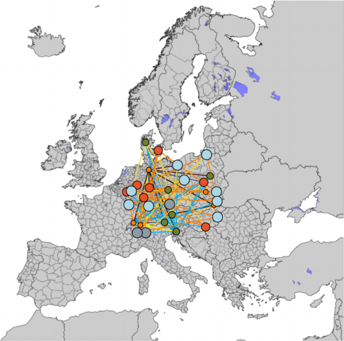
In this second Open Risk White Paper on "Connecting the Dots" we examine measures of concentration, diversity, inequality and sparsity in the context of economic systems represented as network (graph) structures.
Concentration, diversity, inequality and sparsity in the context of economic networks In this second Open Risk White Paper on Connecting the Dots we examine measures of concentration, diversity, inequality and sparsity in the context of economic systems represented as network (graph) structures. We adopt a stylized description of economies as property graphs and illustrate how relevant concepts can represent in this language. We explore in some detail data types representing economic network data and their statistical nature which is critical in their use in concentration analysis.
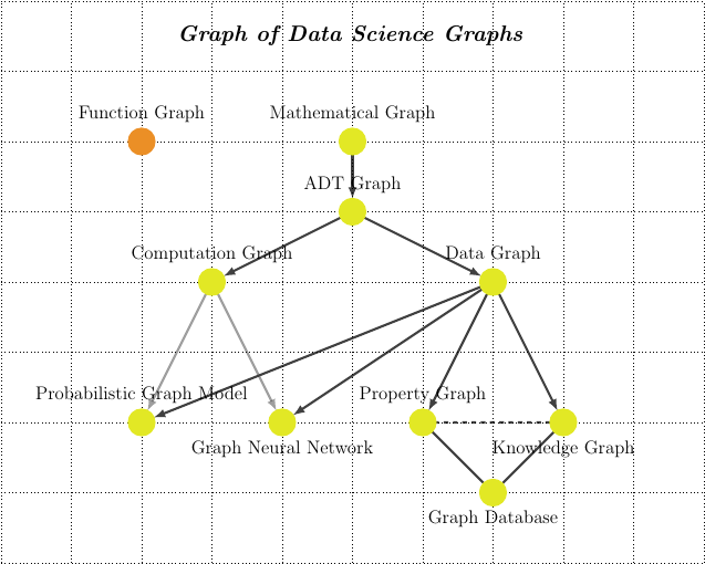
We explore a variety of distinct uses of graph structures in data science. We review various important graph types and sketch their linkages and relationships. The review provides an operational guide towards a better overall understanding of those powerful tools
Graphs seem to be everywhere in modern data science Graphs (and the related concept of Networks) have emerged from a relative mathematical and physics niche to an ubiquitous model for describing and interpreting various phenomena. While the scholarly account of how this came about would probably need a dedicated book, there is no doubt that one of the key factors that increased the visibility of the graph concept is the near universal adoption of digital social networks.
We explore a variety of distinct ways to visualize the same simple dataset. The post is an excursion into the fundamentals of visualization - a partial deconstruction of the process that highlights some common techniques and associated issues.
What this blog post is about (and what it isn’t) With the ever more widespread adoption of Data Science tools (defined loosely as the intensive use of data in decision-making), there is a renewed interest in Visualization as an effective channel for humans to understand information at various stages of the data lifecycle.
There is a large variety of data visualization tools which can produce an ever more bewildering variety of visualization types:
Data Quality and Exploratory Data Analysis using Python In two new Open Risk Academy courses we figure step by step how to use python to work to review risk data from a data quality perspective and how to perform exploratory data analysis with pandas, seaborn and statsmodels:
Introduction to Risk Data Review Exploratory Data Analysis using Pandas, Seaborn and Statsmodels