Visualization of large scale economic data sets
Visualization of large scale economic data sets
Economic data are increasingly being aggregated and disseminated by Statistics Agencies and Central Banks using modern API’s (application programming interfaces) which enable unprecedented accessibility to wider audiences. In turn the availability of relevant information enables more informed decision-making by a variety of actors in both public and private sectors. An excellent example of such a modern facility is the European Central Bank’s Statistical Data Warehouse (SDW), an online economic data repository that provides features to access, find, compare, download and share the ECB’s published statistical information.
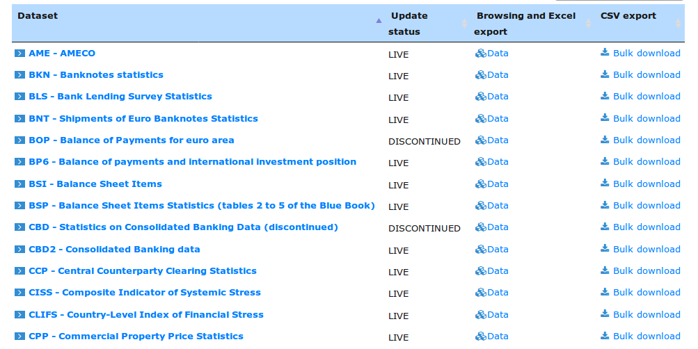
One immediate challenge facing users of such data facilities is the sheer size and diversity of the information set. For example the SDW data warehouse holds and provides access to over 750,000 distinct dataseries, in over 50 major category groupings. One of these, CBD2 is the dataflow holding consolidated banking data. It contains currently 64506 distinct timeseries. One of those timeseries, say CBD2.Q.AT.W0.11._Z._Z.A.F.A0000._X.ALL.CA._Z.LE._T.EUR, contains a sequence of measurements of the total assets in Austrian domestic banking groups, with an observation window ranging from 2014Q4 to 2018Q3
Making effective use of all this abundance requires a range of powerful tools such as accurate and relevant metadata and new visualization approaches that allow exploration and assessment of data sets.
The Portfolio Management Use Case
A concrete use case for enhanced capability to analyse large stores of economic data is portfolio management. Portfolio managers must bridge the gap between macro information as it is embedded in open data sets and their own specific information sets pertaining to specific portfolios. For example stress testing methodologies typically need to connect the behavior of a concrete portfolio driven by a mix of local / idiosyncratic factors to the forecasts of macroeconomic factors. This exercise requires a delicate and difficult search for variables that exhibit meaningful and stable relationships
Central to the design of the OpenCPM platform is the integration of open data and open source modules to empower portfolio managers obtain the insights they need at the most competitive price point. In a new module that is now becoming available, the entire content of the ECB’s SDW repository is made available for exploration and integration with other portfolio management tools.
Adopting a machine learning mindset
In order to obtain a high level overview of the shape and content of the data we adopt a machine learning mindset: We process all the timeseries and create features, useful metrics that can then be visualized or processed further to identify relationships between data.
Observation Window
In the first visualization we plot the observation window of all timeseries (over half a million datapoints after filtering)
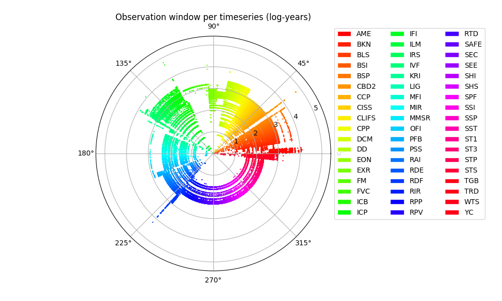
The legend shows a color-coded list of all available dataflows. We notice that timeseries span a very wide range of observation windows, some exceeding one-hundred years while there is obvious clustering around certain key dates (when major groups of economic aggregates start becoming available)
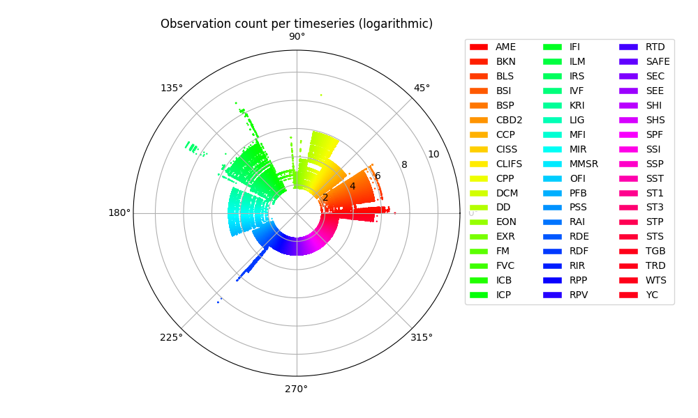
Observation Count
A second interesting feature is the total number of observations per timeseries. This is obviously a function of the observation windown and the frequency of measurement
Timeseries Average
We move next to the actual numerical content of the timeseries and we plot the distribution of the series mean ( average).
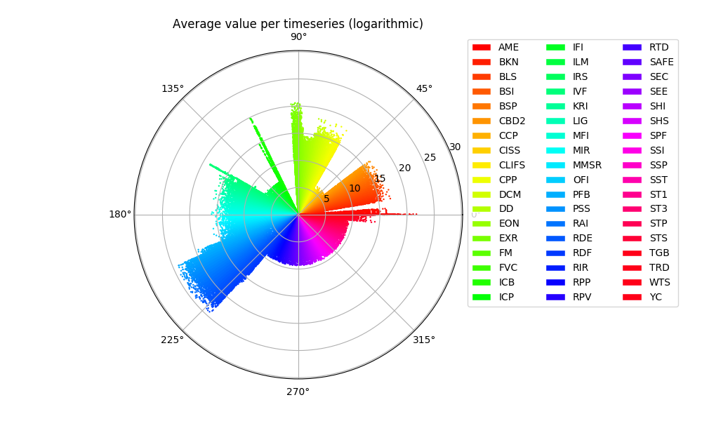
NB: The economic datasets are not normalized in any sense and capture wildly different measurements. Eg. from number of Euro notes in circulation to inflation indices per country. Hence the comparison is only a first glance at the quantitative diversity of the available information.
Timeseries Volatility
In the same token we explore the calculated timeseries volatility. (As with the previous plot, the volatility is calculated unscaled)
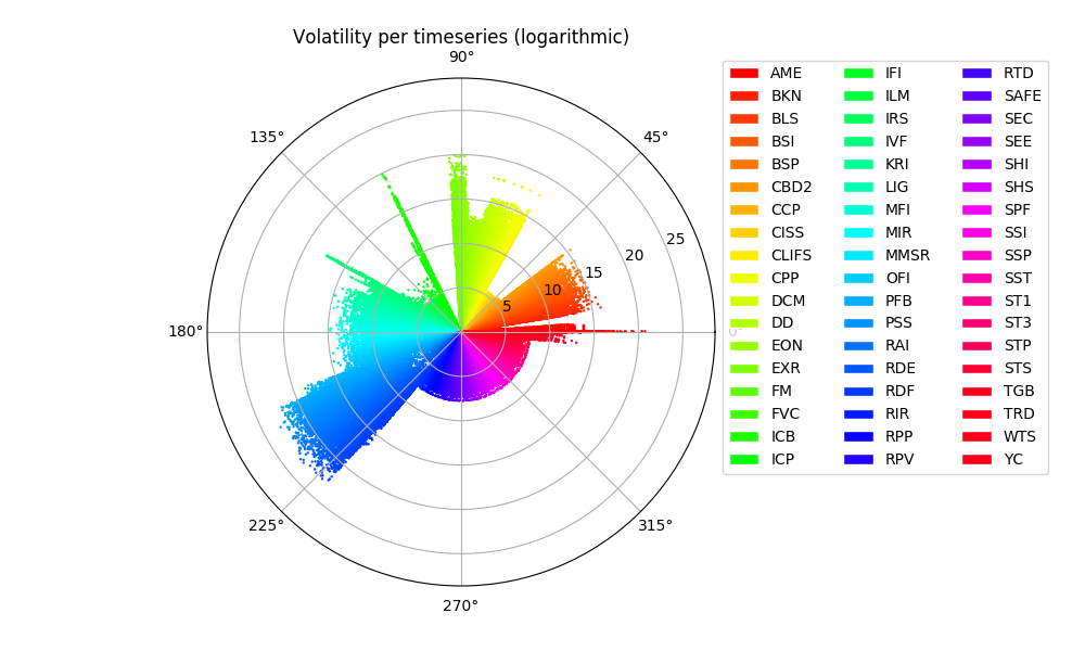
We notice that the pattern is similar to the distribution of the timeseries means, reflecting the underlying reporting scale of the various datasets
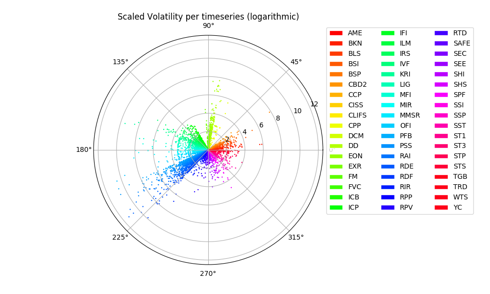
Scaled Volatility
In order to extract fine-tuned information we may need to apply prior knowledge in the form of preprocessing steps that transform the data sets (scaling, averaging, de-trendig, differencing etc.) A simple scaling of the volatility estimate by the maximum level of each timeseries allows to get a first glimpse of the further underlying patterns
EVE, exploratory visualization of economic data
The visualization and analysis of economic data is handled within OpenCPM by the EVE module (exploratory visualization of economic data).
Read more about the OpenCPM design and capabilities
Comment
If you want to comment on this post you can do so on Reddit or alternatively at the Open Risk Commons. Please note that you will need a Reddit or Open Risk Commons account respectively to be able to comment!