Logarithmic Sankey Visualization of Credit Migrations
Sankey diagrams are very useful for the visualization of flows, especially when there is a conserved quantity. They can be tricky when some of the flows are much smaller than others. In the latest release of transitionMatrix we include an example of a log-scale version of Sankey
Using Sankey Diagrams
Sankey Diagrams are a type of flow diagram composed of interconnected arrows. The width of the arrows is proportional to the flow rate. Sankey diagrams are often used in physical sciences (physics, chemistry, biology) and engineering but also in economics. They can be used to represent the relative role and significance of various inputs and outputs in a given process.
Sankey diagrams emphasize the major transfers within a system. They help visually identify the most important contributions to a flow. They are naturally used to show conserved quantities (where the sum total of some property remains unchanged along the flow). In the simplest case one would have a single input $I$ (say the energy flowing into a system from some source) that is split and flows into a number of distinct outputs $O_i$ (each one being an energy sink).
Sankey diagrams are named after Matthew Henry Phineas Riall Sankey who used them in the context of engine energy flows. In actuality, one of the most famous Sankey diagrams predates Sankey’s work by half a century! It is Charles Minard’s Map of Napoleon’s Russian Campaign of 1812.
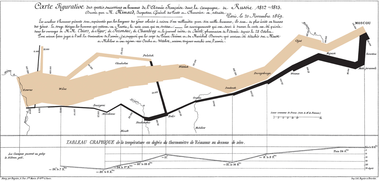
The Minard map is a flow map, overlaying a Sankey diagram onto a geographical map. It illustrates quite dramatically how the size of Napoleon’s army dwindled as it marched along towards Moscow.
Visualizing Transition Matrices
A Rating Migration Matrix (also Credit Migration Matrix, Transition Matrix) is a fundamental mathematical object used in the context of Credit Rating Systems. The matrix captures the probability that the creditworthiness of a certain borrower will transition (migrate) from one credit state (credit rating) to another, over a given time period. Transition matrices can be visualized in various ways, for example as a heatmap of transition probabilities:
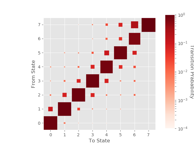
This is a powerful visualization, packing a lot of information (it depicts transition rates from all starting / ending states). Yet the use of color (and/or) size to encode transition probabilities means that it faces an inherent problem when transition rates are very small or differ a lot. This is a frequent scenario in the context of credit rating migrations, where, for example, a AAA rating is (in general) not migrating to the Default state except at very limited rates.
A Logarithmic Sankey Diagram
Could we possibly use a Sankey type diagram to visualize transition rates as a flow? Clearly the rates themselves can easily mapped into “flows”. But how to handle the representation of transition (flows) when some values are much smaller (or larger) than others? Given the with of arrows is proportional to rate some of them would essentially vanish or be difficult to perceive.
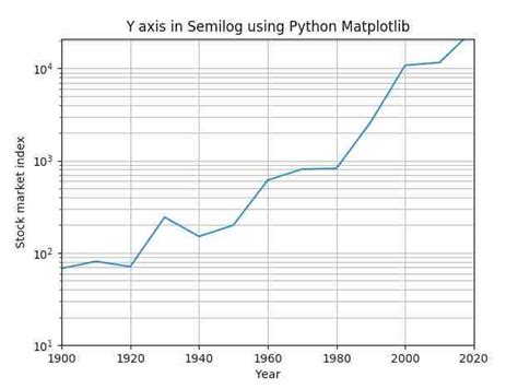
Let us first see how this is handled in simpler plots. What comes immediately to mind is (of-course) the semi-logarithmic plot, where one axis displays the logarithm of the wide-ranging values. This allows values that differ by orders of magnitude to nicely fit in a very familiar semi-log diagram. Semi-log plotting is generally available in all popular plotting / graphing libraries.
Is there any way we could use a logarithmic transformation in the context of a Sankey diagram to bring out small values? Let’s say we have a set of values $v_i$ that represent transition rates (or any flows more generally). By definition ( being probabilities) they must satisfy certain conditions:
$\sum_{i}^{N} v_i = 1$,
and
$v_i > 0$
We immediately see the problem with the “take the log” idea: If we simply take the logarithm of the set of values $v_i$, we will end up with a set of numbers $w_i = log(v_i)$, which:
- may be either negative or positive - without the sign flip having an intrinsic meaning
- the logarithms do not sum up to any meaningful total number
Shifting and Scaling the Logs
Intuitively, what we want to achieve is to shift the logs so that they are all positive, and scale them so that they represent fractional rates (in some new fictitious log-space). More precisely, we can shift as follows:
$w_i = log(v_i) - log(v_{min}) + \lambda$
where $v_{min}$ is the smallest observed transition rate and $\lambda$ is a fixed number (e.g. unity) that is picked to optimize the graphical representation.
We “scale” by setting the “input flow” of the diagram to be the sum:
$w_T = \sum_i^N w_i$
Logarithmic Sankey example
How does it work with a concrete example? The following set of transition rates represents typical probabilities that an initial BB credit rating will migrate to any other credit rating of the set: [AAA, AA, A, BBB, BB, B, CCC, D] within one year.
v = [0.0004,0.0022,0.0079,0.0719,0.7764,0.1043,0.0127,0.0241]
Applying the above transformation we get the following logarithmic Sankey visualization of a credit migration matrix ( similar can be obtained for all input ratings):
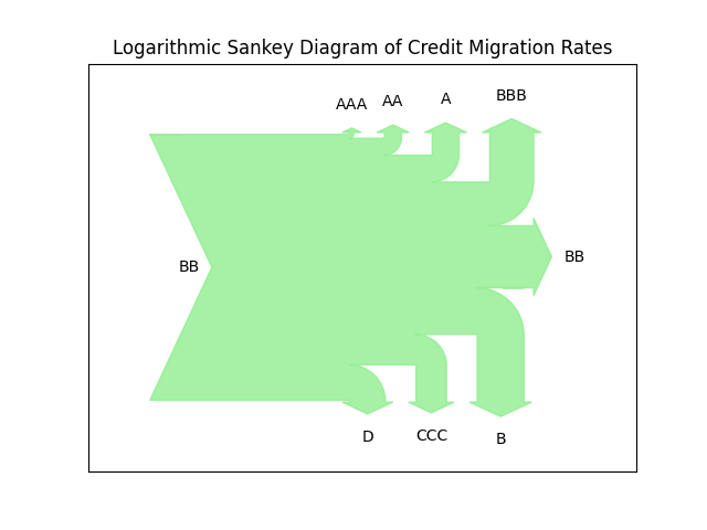
We notice how the vastly different scales of the original values, get squeezed into a much less varying set. The outcome loses its representational fidelity (we no longer can associate the width of the flow with actual values), but we get a more informative qualitative view of the relationship of the various transitions. In this instance we get an impression of relative symmetry between upgrades / downgrades, but also that the flow into the Default state is quite significant (this being a sub-investment grade rating).
The transitionMatrix library
You can find this and other visualizations in the open source transitionMatrix library. The latest release (0.4.7) expands the documentation and example set (can also be found online).
transitionMatrix is a Python powered library for the statistical analysis and visualization of state transition phenomena. It can be used to analyze any dataset that captures timestamped transitions in a discrete state space. Use cases include credit rating transitions, system state event logs etc.
You can use transitionMatrix to:
- Estimate transition matrices from historical event data using a variety of estimators
- Visualize event data and transition matrices
- Manipulate transition matrices (generators, comparisons etc.)
- Provide standardized data sets for testing
- Model transitions using threshold processes
- Map credit ratings using mapping tables between popularly used rating systems
Learn to use the transitionMatrix library at the Open Risk Academy
The online Course PYT26038 (Analysis of Credit Migration using Python TransitionMatrix) is an open and free course at the Open Risk Academy that takes you step by step through the basics of using the library. There are five steps (course sections) that cover the main functionality of the TransitionMatrix package, with applications to a variety of synthetic and real credit data.
Comment
If you want to comment on this post you can do so on Reddit or alternatively at the Open Risk Commons. Please note that you will need a Reddit or Open Risk Commons account respectively to be able to comment!