Visualization

NACE Economic Activity Pictograms

NACE Economic Activity Pictograms

Reading Time: 2 min.
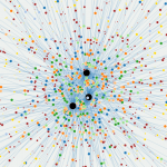
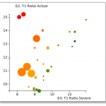
Representing economic activity using pictograms Visualization can produce significant new insights when applied to quantitative data. It is currently undergoing a renaissance that mirrors other developments in computing and data science. Sophisticated open source libraries such as d3.js or matplotlib, to name but a couple, are enabling an ever wider range of users to distill valuable information from the avalanche of data being produced. Yet when it comes to visualizing data that relate to abstract concepts it can be quite difficult to find an appropriate grammar to express the quantitative context.
Transition Matrix Library First Release

Transition Matrix Library First Release

Reading Time: 2 min.
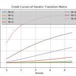
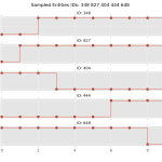
Transition Matrix Library First Release Open Risk released version 0.1 of the Transition Matrix Library Motivation State transition phenomena where a system exhibits stochastic (random) migration between well-defined discrete states (see picture below for an illustration) are very common in a variety of fields. Depending on the precise specification and modelling assumptions they may go under the name of multi-state models, Markov chain models or state-space models. In financial applications a prominent example of phenomena that can be modelled using state transitions are credit rating migrations of pools of borrowers.
Visualizing the Stress of US Banks

Visualizing the Stress of US Banks

Reading Time: 4 min.
Visualizing the Stress of US Banks A recurring cycle of regulatory stress testing exercises has become the new normal in the banking world, at least on the two shores of the northern Atlantic. The periodicity of the European stress testing heartbeat has not yet been firmly established. Did we just miss a beat in 2015 (a so called palpitation) or will the European cycle have two (or more) years periodicity? Who knows.