Electrifying the Doughnut: Simplified Visions of Sustainable Finance
June 21 2023 marks the sixth annual #ShowYourStripes Day - a time when meteorologists and other climate communicators around the world raise awareness of our warming planet by displaying colorful visuals of climate change. The warming stripe graphics are representations of the change in temperature over the past 100+ years (here we use the global average). Each stripe represents the temperature averaged over a year. The stripes typically start around the year 1900 and finish in 2022.

Why June 21? It’s the day the summer solstice occurs. It is also the start to the season with the biggest extremes (heat, hurricanes, wildfires). An opportune moment, thus, to put together a few words and visuals inspired by the remarkable sustainability transition journey we have embarked on as societies, the changes this may bring to the shape of economic activities to come, the structure of future financial systems and the new challenges for risk management.
How to visualize Sustainable Finance
Global warming has got a visual imprint via the warming stripes. But what would Sustainable Finance look like? This is the metaphorical and a literal question we want to tackle in this post. Let us start with the literal part. The formal definition of Sustainable Finance according to the European Commission (which is the standard text associated with the term) reads as follows:
Sustainable Finance refers to the process of taking environmental, social and governance (ESG) considerations into account when making investment decisions in the financial sector, leading to more long-term investments in sustainable economic activities and projects.
Sustainable finance is both about financing what is already environment-friendly today (also termed Green Finance) but also supporting a transition to environment-friendly activities over time (Transition Finance). Far from a theoretical discussion, sustainable finance is rapidly getting embedded in wide-ranging policy frameworks and arguably is destined to become a cornerstone concept in finance in the next few decades.
The official definition is sparse on details. What sustainability (ESG) aspects are we to take into “account”, how to account for them, who is accountable for them, and how does it all together with existing norms and practices (the body of practice we might call unsustainable finance)? While the broad brush strokes of sustainability might be clearly recognized (not least thanks to the work of pioneers in various sustainability domains), the details of the picture are hardly settled. To compound the fact that sustainability is already a diverse bag of concerns, “finance” itself is also a large domain of practice. Finance spans a range from monetary instruments and financial contracts, to information technology infrastructure, legal structures and laws and regulations to name but a few important aspects. Substantial variations in financial systems exist between different jurisdictions and this can also materially affect information flows, responsibilities and incentives of the economic agents involved. What we are trying to visualize is a fairly intimidating landscape of two exceedingly complex and interacting domains. We will need to keep this in mind and set expectations accordingly.
The conceptual and practical challenges facing sustainable finance have deeper roots, namely the still nascent stage of the discipline we might call Sustainable Economics. Conventional economics is the social science that studies the production, distribution, and consumption of goods and services. Whether the economy itself is sustainable has not been considered part of the discipline. Despite this awkward narrowness of focus, efforts in economics did culminate into a large body of knowledge, many useful abstractions, empirical data collection activities, analytical tools and policy instruments and so forth. Yet the original sin of not embedding tangible linkages with what one might call our physical reality1 has finally come back to extract its toll. Rethinking and rebuilding economics to serve, among others, as the basis for practical and coherent sustainable finance will take its incubation time. Much ink and gray matter is already been dedicated to various new or renewed branches of economics (behavioral economics, industrial ecology, stock-flow consistent macroeconomic models etc.) but these newborn stars don’t quite form yet a visually recognizable constellation to help us navigate.
Sustainable doughnuts and other visual geometries in economics and finance
Economics and finance are intrinsically abstract domains which are hard to visualize. Open any economics or finance textbook, and you’ll be greeted with a lot of prose, arcane equations and generous servings of numbers in tabular form but few if any visual representation of economic or financial phenomena. At best one might see in the early pages graphical elements such as stylized diagrams depicting supply and demand curves. In later chapters on might see various visualizations of data timeseries: These are measured economic or market observables (incidentally, here are 21 ways of visualizing a timeseries) that capture some aspect of the economic system but are very far from providing intuition about the inner workings of the system itself.
The case for visual representations of sustainable economic thinking has been made eloquently by Kate Raworth in her Doughnut Economics book. The starting point towards understanding the famous doughnut visualization takes us back to a precursor visualization, the illustration of how the economic system is taxing the biosphere. An influential visualization of this concept was first introduced as the Planetary Boundaries diagram.
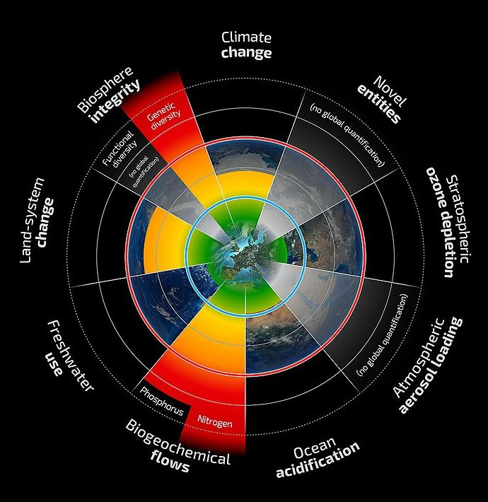
The central quantitative metaphor used in the Planetary Boundaries visual is that of a polar plot where different angles range over different sustainability dimensions (hence categorical in nature) and the radial distance indicates the value of a relevant metric. A circular rim (colored red) forms the sustainable boundary. Key environmental metrics might be distributed above it (when exceeding the sustainable threshold) or below it (when the economy lives within its biosphere means). The use of scaled values to normalize all thresholds to the same radius is required. This visualization design allows indicating, at a glance, which boundaries are out of balance (biosphere thresholds being exceeded). The explicit insertion of the Earth’s globe in the visual reinforces the finiteness and vulnerability of Gaia.
Note that the original visual is oriented towards environmental challenges and is agnostic about any social conditions associated with the human economic activity. While in principle one could simply add various Social and Governance dimensions next to environmental (E) concerns, the visual of a Doughnut Economy more economically completes the depiction of a wider range of concerns. It achieves this by introducing a second metaphor: an inner boundary that documents the social foundation of the economy.
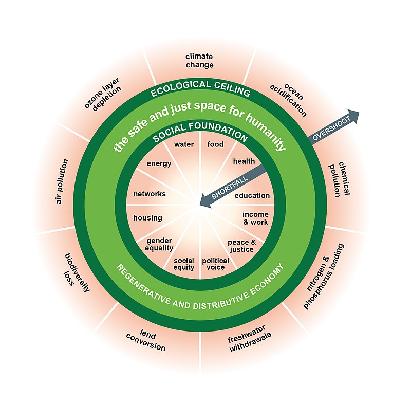
The two visuals we discussed do an excellent job at representing at a glance the challenges of sustainability. They elevate important aspects of the human condition to be measurable targets, breaking the monopoly of using the sustainability agnostic GDP measure. These visuals are not to be taken too literally. For one thing, amusingly, an actual doughnut is not actually a planar shape but a three-dimensional structure (the mathematical name is a torus ). Yet a true doughnut (a torus) is not particularly evocative of the “safe zone” that one wants to confer with the diagram and not particular usable as a visual. A 3D sphere with an inner and outer shell might serve that purpose better (and reinforce the association with the Earth at the center) but using 3D diagrams is decidedly more complex. Another remark on the visualization grammar used in both those diagrams is that when adopting polar geometries there is an inadvertent visual bias. The inner regions (closer to the origin of the coordinate system) are granted less visual space biasing our perception of relative importance. An alternative visual solution would be to lay out the environmental and/or social boundaries next to each other as linear levels. The tradeoff is losing the intrinsic economy and finite Earth associations evoked by the circular structure.
These remarks merely reinforce the challenges of translating abstract economic concepts into practically usable visualizations. The above iconic depictions use the available dimensions of the two-dimensional surface to highlight some dimensions of a sustainable economy. By necessity, they must “hide” other fundamental aspects. Let us discuss briefly one such aspect. Mathematically and rather generally, imposing some form of “sustainability” on a general dynamic system is a type of constraint. The constraint expresses a restriction on the possible configurations of economic activity (for example requires the elimination, reduction or alteration of certain patterns of production, distribution and consumption). The abstract space of all possible economies (all such patterns) is then split into the subset that is sustainable (satisfies the constraint) and the (much larger) set that is not. We saw that the sustainability constraints (as captured by ESG) are defined at high-level to start with. What we highlight here is that they also do not prescribe exactly what the economic configuration should be. There is an infinity of possible ways to be “sustainable”. The narrower the definition (e.g. addressing only climate change as induced by GHG emissions) the broader the range of compatible economic options. Furthermore, and very relevant for the practical implementation of sustainability measures and their financing, there are many pathways or scenarios to getting to any desired point, scenarios that are differentiated by the speed and type of any intermediate configurations.
This general state of affairs can be captured visually as a surface in three-dimensional space (the more general term is hypersurface ). In this metaphor, any concrete economic state (condition) is described by a “point” in this abstract space. The starting point of an actual economy may be anywhere in relation to the sustainability surface. The further away from it the more “unsustainable”.
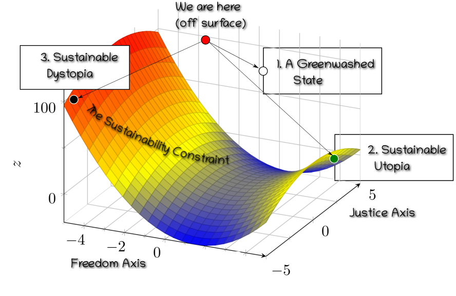
This approach to visualizing sustainability emphasizes the fact that:
Alternative paths and alternative end-points are possible in the journey towards a sustainable safe zone. Recognizing these "hidden" dimensions and the multiplicity of pathways will be important elements in the sustainability transition. Specifically for sustainable finance they require that the financial system internalizes a holistic view of sustainability that cannot be gamed.
Spherical Cows in (Sustainable) Economics
So far so good, we discussed a variety of high-level visuals and their possible utility to convey concepts around sustainability. But how can we get closer to visualizing actual economies? Clearly an economy is an immensely complex thing. Millions or billions of individuals, countless diverse means of production, distribution and consumption of goods and services, a wide range of natural elements being affected differential by different types of human activity, many internal organization patterns to name but a few complexities. When facing a complex and multidimensional problem our natural attitude is to consider some simplification. In this task economists and other scientists frequently use a technique that has been perfected in the physical sciences. It is a methodological approach based on the radical elimination (abstraction) of any aspect or attribute of a physical phenomenon that is not considered to be fundamental for the problem we want to tackle. There is a subjective element to it, in the sense that one declares what specific aspect one is interested in and postulates that it is actually possible to apply an analytic rather than a holistic approach to studying that aspect.

The approach has come to be (rather pejoratively) termed the Spherical Cow approach to complex phenomena. What is a spherical cow? The anecdote story is that a dairy farmer once wrote to a university department, asking for help from academia about addressing a certain low milk volume production problem. A team of professors was assembled, headed by a theoretical physicist. After local investigation and gathering data the scholars solved the problem and reported back to the farmer. The physicist started the presentation as follows: “Assume your cows are spherical, with radius R”. The metaphor refers to the physicists’ tendency to reduce complex problems to their simplest form in order to make calculations feasible. The simplification might hinder a model’s application to reality but this is deemed a price worth paying at an initial stage. The expectation is that if the simplified calculation carries through and is validated in some form, one can always iterate and improve by adding complexities later.
Why would spherical cows be useful at all? Let us imagine that part of the exercise is investigating how much energy the cow dissipates to the environment through its skin. This will likely be related to the cow’s total surface area. Under a spherical cow assumption, that area is simply $\pi R^2$ where $R$ is the effective radius of the cow. For a real cow the actual surface would be the result of a laborious measurement that takes into account its complex geometry. The reason an approximation might be useful is not only saved labor. Having at hand a formula for the surface area means we can ask questions like what if the radius of the cow doubles?. Devising a sufficient collection of other such formulae and establishing causal relations between them may lead to a “grand unified theory of cow milk production”. Such well-developed conceptual frameworks help answer questions that might, in the first instance, appear intractable.
While the imitation of physics in economics has led occasionally to backlash and accusations of obfuscation and Physics Envy, borrowing ideas from other disciplines should always be judged on their effectiveness on a case-by-case basis. Economists have for the longest time developed an important spherical cow approximation of their own!
The most beloved Spherical Cow of economists is the rational Homo Economicus, namely idealized economic agents who are consistently rational, narrowly self-interested, and who pursue their subjectively defined ends optimally at every moment of their life's journey.
Practically all assumptions leading to the model Homo Economicus have be challenged. For our purposes the important deficiency is of different, visual nature: The species of Homo Economici are dematerialized sets of large numbers of homogeneous economic agents. They “float” in mathematical space that could equally well describe the economy of giant shrimp floating in the planets of Alpha Centauri. Understandably economics has tried to avoid the messy problem of coupling physical reality too closely with data and models. Qualities of the natural environment are not completely ignored, they feature indirectly: Goods and services, production and consumption modalities etc. are abstract menus of choices available to Homo Economici. Nevertheless, there is already a long-running branch of economics that integrates some elements of physical reality. It goes under the name of Economic Geography . This sub-discipline focuses on the location of industries, the economies of agglomeration, patterns in international trade, the economics of urban form and, increasingly, the relationship between the environment and the economy. Economic geography gives us a handle towards various stylized representations of economic activity that might also be relevant in the context of sustainable finance. While its principal visualization tool is the well known geographical map, properly annotated with graphical elements of economic interest, for us this will be rather the starting point.
Urbanization patterns and connecting all the dots
The increasing urbanization of the human population is a fact. It is predicted that by 2050 about 64% of the developing world and 86% of the developed world will be urbanized . Cities are, thus, to a first approximation where people live (produce, consume and are economically active).
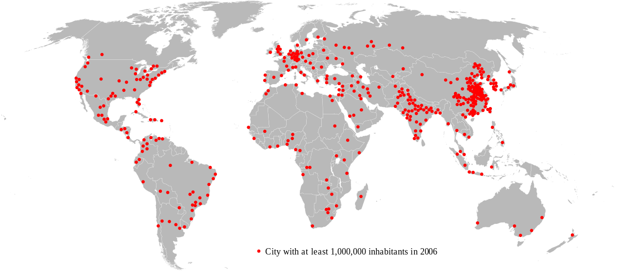
Obviously many vital economic activities (agriculture, transport of goods and people, energy production and transmission, information exchange via submerged cables etc.) are not happening within the narrowly defined perimeter of a city. But they do happen in general in a suitably defined city neighbourhood.

Defining the city neighbourhood as the actual administrative region to which cities belong is entirely possible, but it complicates representation by introducing detailed geospatial contours. A simpler mathematical model for a partition of a surface is the Voronoi diagram , which uses linear segments to partition the plane into regions that are close to each of a given set of objects. Conceptually we do not even need that simplification: what we principally need is the abstraction that all land and sea is associated with one or more urban centers. This allows us to ignore (for some use cases) the surrounding area altogether.
Before we proceed, why do focus on cities at all, given that we know they are not the dominant societal pattern from governance perspective2?. Human economies in last few centuries are predominantly organized and governed as Sovereign Countries (Nation States). This nation-level organizational pattern is highly relevant for the shape of sustainable finance. Environmental impacts and budgets for GHG emissions are generally agreed at the national level (Nationally determined contribution ). Financial systems closely follow national boundaries, starting with the foundation of fiat currency and where it is considered legal tender, banking system extend and regulation, the availability of “safe financial assets” in the form of government bonds and much more. Given the essential role of the nation state should we maybe consider using countries as the “building block” for representation? While for some high-level work that might be appropriate (and also reduced the number of entities required), the large dispersion of country size means that country-level aggregation is not a good match to the ecological systems that the economy interacts with.
By focusing on city-level economics we gain fidelity in the association with the physical environment while we don’t lose realism in the representation of economic structure: Countries can, in this picture, be approximated as a collection of cities that share similar Urban metabolism and joint governance. In any case it is true that much of the relevant data collection (e.g. official statistics, input-output database) happens at country level. Translating back and forth between the two levels will thus be typical. Cities can be usefully classified using a typology of two dimensions: population size and level of development of the country in which they are located. Such a typology distinguishes nine types of cities in total: small, medium, and large cities in low-,middle-, and high-income countries.3
The final remark on this topic is that the accurate geographical representation of the collection of urban centers (by means of the latitude and longitude of the city center and a suitable map projection) is not the always sufficient to capture the economic system described. For example, transport connections via land, sea and air and various other distribution networks (pipelines, grids) change the topology of the human geography. Many interesting visualizations exist that show distances between urban centers as measured by commuting time. Maybe the most environmentally impactful such topology change is the worldwide network of maritime transport links.
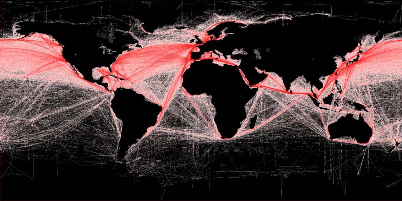
We started our quest for a simplified representation of where human economic activity happens as map-derived graph of urban nodes, and we then augmented this graph with important additional connections. With are ready to collect our first spherical cow award!
The first outcome of our simplification journey is that we have identified an enumerated collection of urban centers (nodes) connected via tangible and intangible edges representing economic exchanges. This is the main canvas on which we can visualize human economic activity
Sustainable energy makes sustainable cities
We already alluded to how sustainability spans a vast and multifaceted range of topics. How vast? The Sustainable Development Goals cover a wide range of issues, numbering 17 at the highest level grouping:
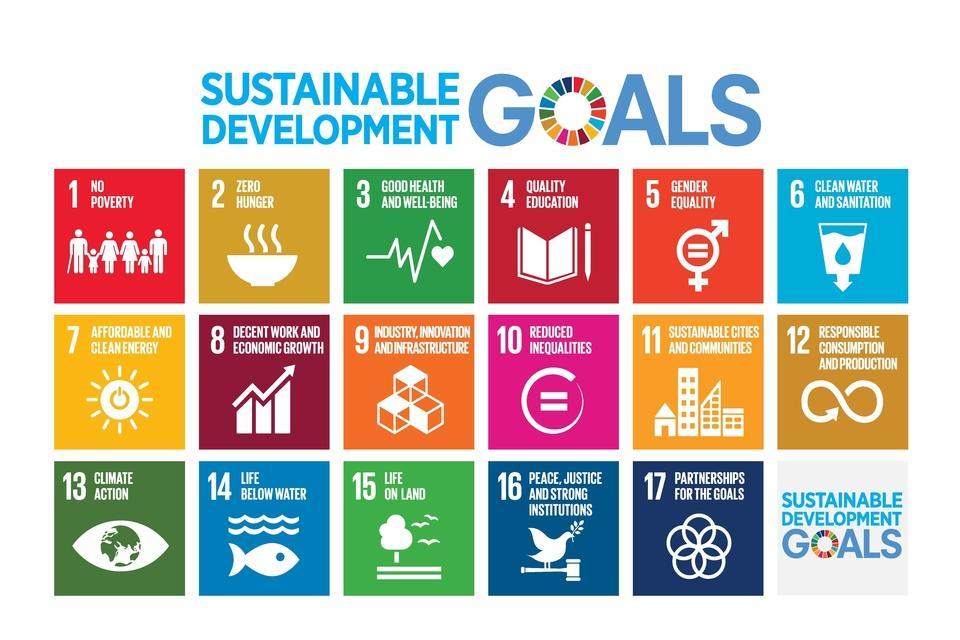
It is unlikely that we can integrate all the diverse Sustainable Development Goals (and implicit challenges) into a simple workable abstraction. There is no meaningful sense in which one of those areas might be deemed more important than another. One may usefully study how one can integrate these concerns in terms of more fundamental structural elements (See Schoenmaker4) but that remains, by necessity, a higher level discussion. What we pursue instead is a drastic one-two combo punch on complexity. Out of the overall sustainability agenda (the whole range of SDG’s), we focus on environmental sustainability (SDG 7). Out of the wide range of environmental concerns we focus on energy use as the all-encompassing attribute. Out of the wide range of social concerns we focus on sustainable cities (SDG 11). This selection is clearly a procrustean simplification. Ultimately, as with all spherical cows, the question is whether the choice will be justified by making some aspect of the visualization problem more tractable.
The motivation to focus on energy is because it is in various ways the key factor in the sustainability discussion. Energy systems and their major role in climate change are documented in great detail in the IPCC Report5. The report highlights, in particular, that current socioeconomic systems are based on high-carbon economic growth and resource use. Several systematic reviews, starting with the seminal work of Ayres and Warr6 confirm that economic growth is tightly coupled with increasing CO2 emissions from increased energy consumption. The causality relation between energy and economic growth as measured by GDP is complex: in various studies and contexts (i) energy consumption causes economic growth; (ii) growth causes energy consumption; (iii) there is bidirectional causality; and (iv) there is no significant causality. Loosely coupled to energy consumption is also the linkage of social issues such as inequality and energy poverty , defined as the lack of access to modern energy provision. For our purposes the important point is that energy use is the strongest component driving environment sustainability in the current stage of economic development.
One final bold simplification we will do is to focus exclusively on electricity as the source of final energy consumption. This is decidedly a forward-looking choice: According to IAE calculations7 and projections, final consumption of electricity increases by 25% from 2020 to 2030, and by 2050 it will be more than double the level of 2020, accounting for about 50% of all energy consumed. Given it is likely that various economic activities will for a very long time require some other type of energy source (cannot be electrified) is the focus on electricity justified? There are two motivations: First, electrification is a significant indicator of social development. Secondly, the production and distribution of electricity is typically through system-wide utilities that can more comprehensively document the flow of energy in the economy. Nota bene: The energy mix involved in the production of electricity will vary, with an ever-increasing fraction coming from renewable sources. Capturing the primary energy mix and its potentially complex forward trajectory in production and consumption is not something we want to simplify. The next visual gives us a glimpse of the residual complexity we still face in identifying our actual constraints:
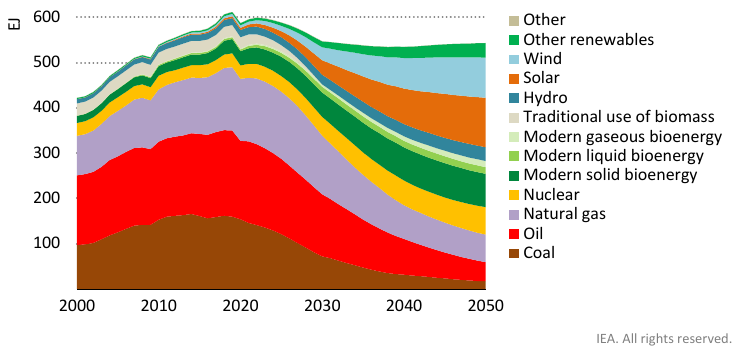
As the IEA graph amply suggests, sources of useful primary energy are varied and will likely remain so for a long time with new technologies potentially increasing the options. The distribution of energy is also likely to involve several modes: e.g. heat or cooling infrastructure or green hydrocarbons on ongoing basis.
The second outcome of our simplification journey is that we have identified energy consumption (in various mixes) as the comprehensive measure of environmental footprint, and we consider that all of it is delivered to final consumption via electricity. The required and expected strong downward slope of non-renewable energy forms expresses the sustainability constraint in a simplified form. This also known as Bending the Curve. Second Spherical Cow Level Unlocked!
Let us recap what we have sketched so far:
- A representation of human economic activity as a graph of connected urban nodes
- An assertion that energy flows from primary sources (classified by their sustainability profile) to final consumption is the sole enabler that empowers economic activity within nodes.
- The assumption that all final energy consumption is via electricity.
Interconnected urban economies embedded into the energy system
Let us zoom out to include all urban nodes and get the big picture. We now refrain from showing geographical map details. The visualization space can be used to capture economic proximity, suitably defined. Various connecting edges can be used to indicate material, energy or capital flows. Color coding can be used to represent economic or sustainability metrics that might characterise urban nodes or their connections.
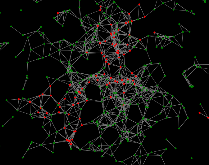
What will we “see” if we take a magnifying glass and look into the node representing a particular urban center? The answer depends on our objectives and the magnification we want to work at. Broadly speaking we have two principal dimensions: to highlight the physical reality of the urban environment or to represent, instead, its economy reality.
In the first option the visual space becomes again a proxy for geographical space. In the second option the visual space is used to represent economic relations (such as supply chains).
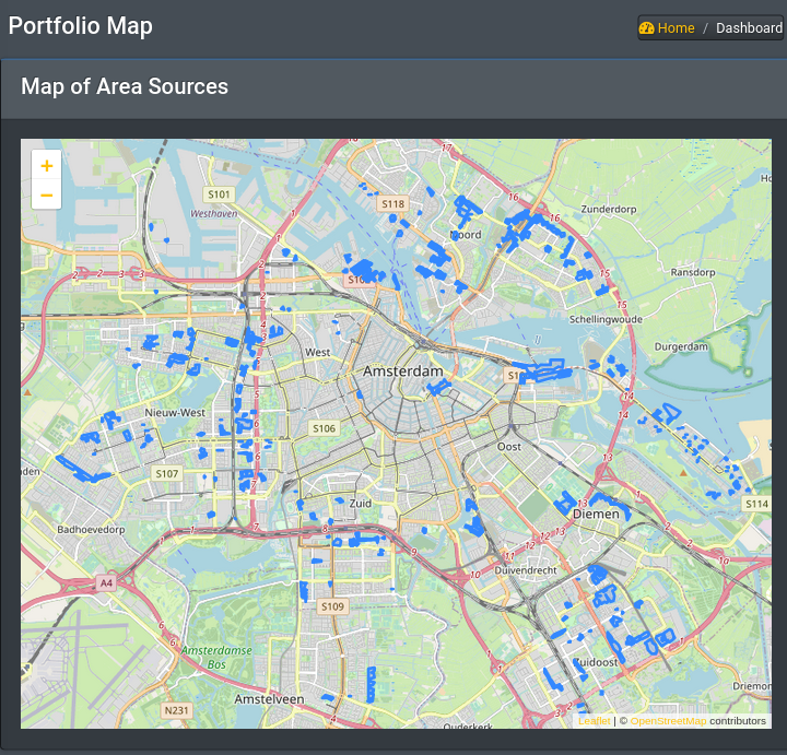
While a visualization of urban node interiors using spatial resolution will be useful for many purposes, it has many limitations. For example, we may not be interested in the particular location of energy sources within the urban region. But we might be keenly interested to see who is consuming the energy produced by each source. An alternative visual representation that focuses on economic relations can be squeezed into a pictogram representation of an urban center as follows:
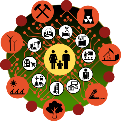
Tracing the flow of energy within the urban economy is alas not so simple. There are two major complications:
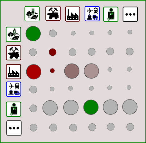
The first is the fact that production processes (expressed as business sectors in the above visual) have complex supply chain dependencies. This view of the economy is not new. At the aggregate, statistical level input-output models go back at least to the work of Leontief and his Leontief Model and conceptually further back to the Tableau economique of Quesnay. We can address this visually by producing a second representation of a matrix of sectors exchanging monetary flows and energy flows.
The second difficulty is that a large majority of production will not be local to an urban region but rather imported from other regions. At the statistical data gathering and modeling level this is handled with a multi-regional approaches. The visual representation of these global interconnections is more challenging as they tend to produce dense sets of edges.
We now have completed the first leg of our journey, focusing on the real economy. The main features of the visual representation center around a global graph of urban nodes as the overall canvas which can be zoomed-in, selectively, to reveal various facets of the internal workings of each urban node.
We used a stone carving hammer to simplify the representation of a sustainability economy. We found that fidelity to the actual flows of energy (and hence highlighting responsibility) can still be tricky in a highly interconnected global world. This will be compounded further when we try to overlay the financial system!
The Seven Heavens of Sustainable Finance
We are now ready to tackle another entangled hairball, namely the financial system. So far we have implicitly focused on so-called real-economy activities. Those cannot actually happen without some facilitation from the financial system. Economic actors in our representative urban nodes are enmeshed and interact with each other using tools provided by the financial system. The end result is very complex web of monetary flows and contracts that parallel the flow of goods and services.
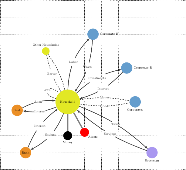
Financial intermediaries can be very complex entities of their own. In the context of sustainable finance the role of financial intermediaries is paramount in tracing in verifiable manner the footprint of economic activity. Yet as we discussed in an older post, the Seven Heavens of Finance, even in the simplest case of a “vanilla bank”, the system features layers upon layers of information flows and aggregation, some driven by conventions some by regulation.

Unravelling the seven heavens of sustainable finance is an important exercise, but it will not help us immediately on the visualization front as many of these layers are too abstract. Yet a summary visit might be worthy as it indicates at which level one might be able to form a “picture” of sustainable finance activities to complement what we have discussed so far.
The political, legal and regulatory layer
At the highest level the financial architecture is determined as a set of design choices. These are instituted typically at the national level. The challenge of illustrating the role of sustainable finance at this level lays precisely in the enormous transformative power available here: New markets, new contracts, new disclosures, new taxes, new buffers and potentially, new forms of money are all a matter of social contract. As already discussed, there are significant examples of such transformations already afoot. One further example suffices to illustrate how regulation can reshape systems more structurally. Urban nodes need not have uniformly identical financial systems. Arguments have been made that, for example local or complementary currencies may play an important role in promoting sustainability8 9.
Sustainable Financial Intermediaries
Historically the business models and constraints under which financial intermediaries operate would not feature any sustainability concerns. In recent developments, in particular this decade, the picture is changing. A range of ESG risk assessments and disclosures are happening either as self-imposed codes of conduct or externally imposed legal and regulatory requirements, including novel concepts such as climate risk stress tests. Such stress tests are highly non-trivial. There is a mismatch between the risk horizons that different entities operate (Tragedy of the Risk Horizon ).
Sustainable Portfolio Management
In the specific case of GHG emissions the adopted approach to develop a sustainable management strategy is to build attribution schemes that assign environmental impact on the basis of contractual information and the nature of the economic activities of the beneficiary (for example their volume of GHG emissions). In the nomenclature of the GHG Accounting Protocol this approach is in conformance with the design of Corporate Value Chain (Indirect or Scope 3 Emissions) as expressed in the Accounting and Reporting Standard for Category 15 investment activities 10.
Sustainable Corporate Reporting
There are important, epochal, developments on this front. The Corporate Sustainability Reporting Directive requires large companies and listed companies to publish regular reports on the social and environmental risks they face, and on how their activities impact people and the environment. A first set of reporting standards has already been developed European Sustainability Reporting Standards (ESRS).
Integrated Accounting
At the most granular level we enter the domain of integrated accounting and reporting (See Deep Linking Financial and Energy Accounting and Integrated energy accounting using relational databases)
This realm is where monetary flows can be matched, e.g., with energy certificates (such as the European Energy Certificate System ) and provide a granular attribution of energy consumption to fairly low-level cash flow exchanges. Theoretically, with sufficiently sophisticated information technology infrastructure the capture of environmental impact (as measured by electricity consumption) can be as granular, real time and comprehensive as any monetary representation. Ultimately, the quest for sustainability is a quest for responsibility. Responsibility rests with individual persons to conduct economic activities that are compatible with a set of global constraints. The financial system both enables and documents economic activities and is thus well-placed to capture the interdependent monetary and sustainability dimensions in a coherent way but also to disseminate them in a digestible way.
We have reached the end of the road in our quest to visualize sustainable finance. Or rather, we have reached a cliff and got a glimpse of what landscape may lie beyond. At every step we realised the enormous complexity of the systems we want to capture in an intuitive and informative way, and we concluded that simplifications are essential to gain partial insights. We have gingerly sidestepped many difficult issues around sustainability: The technological uncertainties. The political differences of opinion. The question of justice and solidarity between various populations that bear very different responsibilities for the status quo. These difficulties motivate us to place more emphasis on generic, widely applicable information tools that will retain relevance and provide valid guidance even as the sustainability surface twists and turns in the years to come.
-
The failure of economics to address “conventional” concerns such as financial crises is well documented ↩︎
-
Historically there have been periods where organization in so-called city-states has been a dominant pattern in at least some regions ↩︎
-
Mukim, Megha, and Mark Roberts, editors (2023). Thriving: Making Cities Green, Resilient, and Inclusive in a Changing Climate. ↩︎
-
D.Schoenmaker, The Impact Economy, Balancing Profit and Impact, Bruegel, July 2020 ↩︎
-
IPCC Sixth Assessment Report (AR6), WGIII, Mitigation of Climate Change (2022) ↩︎
-
Ayres, R. U., and B. Warr, 2005: Accounting for growth: The role of physical work ↩︎
-
IAE, Net Zero by 2050, A Roadmap for the Global Energy Sector (2021) ↩︎
-
Gill Seyfang and Noel Longhurst, Growing Green Money? Mapping Community Currencies for Sustainable Development (2013) ↩︎
-
Filipe Moreira Alves, Rui Santos and Gil Penha-Lopes, Revisiting the Missing Link: An Ecological Theory of Money for a Regenerative Economy (2022) ↩︎
-
PCAF (2020). The Global GHG Accounting and Reporting Standard for the Financial Industry. ↩︎
Comment
If you want to comment on this post you can do so on Reddit or alternatively at the Open Risk Commons. Please note that you will need a Reddit or Open Risk Commons account respectively to be able to comment!